Chaos and Kanji is the blog where I write about my adventures through Japan!

Want Lists are located here. NPB Baseball Want List is located here.

Monday, October 31, 2011

A Cardboard Scare!

That's one scary image, isn't it! Imagine a whole room FILLED with 1989 rack packs!

Wait, it gets worse...
Eek! 1991 Fleer!

Oh my! 1991 Fleer with a shirtless guy who looks to be sporting a mullet!

Oswalt sure is one scary witchwizard.

Scary mask, man!

I don't know whether to scream or cry!

Now THAT is SCARY! I bet he ate that football for lunch!

I'm trapped in a bad 1980s Eddie Murphy movie! Ahhhh! Help me!

Okay, that's not too scary - unless that's a TUMOROUS GROWTH IN HIS JAW!

But there's one more scare left for you. Can you guess what it is?

No, that's not it...

Neither is that, though that is a totally awesome prop.

YOU READY?!
.

.

.

.

AHHHHHH!


Happy Halloween!

(I'm sorry, Don Mossi.)

Topps Diamond Giveaway Site

Okay, seriously, this is pissing me off. I don't know what's going on, but the usually slow Topps Diamond Giveaway website is now essentially non-functional. It loads slowly if at all. I'm getting error messages just trying to browse through trade offers. Making an offer takes about as long as writing a symphony, and accepting a trade offer only results in errors.


I know to expect slower service during peak times - evenings and weekends especially - but I was trying to complete a trade at 2AM last night and couldn't get it to go through, and now at 11AM I'm having the same problems and worse. The site wouldn't even load the first time I tried getting to it.

This type of poor design is a huge turn-off for me, and I'm sure other collectors. Why should I continue to buy Topps products to obtain codes for a website that doesn't even work? I need nine more codes to reach 45 rings, so I'm going to reach my goal, but this experience just means that next year I'm not even bothering with the code cards.

Topps Decade in Review: 1981-1990

I realize I've sort of misnamed these posts, but once I started the run, there really wasn't any turning back. This is the third in the series - I've covered 1991-2000 and 2001-2010 already. Have a look, if you're one of my new subscribers, to get an idea of what's going on here. (And welcome, to those of you who have recently subscribed!)

 1988 Topps is one of the least interesting card designs released as a major set of all time. They took the design elements of 1966 Topps and switched them - the team name runs across the top of the card instead of in a corner banner, and the player's name is in a banner instead of across the bottom. However, if Topps were to use this design today in a Stadium Club-style set, without the borders, I'd love it. There's just not enough quality to the printing or photography to focus so much on the photo, and leave so little to the design.
 If 1988 was boring, what is this? The only saving grace here is that I sort-of like the team name font with the black background at the top. It's like Topps was saying, "Hey, you liked the 1971 black bordered set so much, we'll give you just a taste of black border again in 1986!" Other than copying the team name font, this has to be the easiest card image to duplicate for spoofs or custom cards.
 This set is a little 1970s for use in a 1982 set. It reminds me of those technicolor logos and designs that were made to look like they were three dimensional. If this design was tweaked a little and used in 1973, it would have been great - just like the Bowman TV set!
 This 1984 set is only ranked so highly because of the second photo, but who wants a second photo of Craig McMurtry? Unless, of course, you're putting together a mustache set. Or a nerdy 1980s glasses set.
 Coming at 6th best of the decade is the 1989 issue. If you didn't start collecting in 1989 like I did, you would probably rank this much lower, and I had to let my feelings not become too involved when setting this list up. The 1980s Topps sets were full of straight edges and sharp corners in the design, and the softer cursive team names and sweeping banner for the player's name makes this design just a little more friendly than most. This is also the only set in the decade to use lowercase letters (other than the "topps" logo itself).
 A second picture is included with the 1983 set, just like the 1984 release. But this earlier issue ranks higher because there's a big circle instead of a box.
 I may anger some people by placing the beloved wood grain laminate 1987 set fourth in the list, but for a long time I would have placed this toward the bottom of the rankings. Only recently has the wood border design grown on me - and no, the 1962 set and this year's Heritage didn't help things.
 I may anger even more people putting the 1990 set so high on the list. 1990 holds a special place in my heart, with its bright, fun, colorful borders fading into each other. It's almost reminiscent of 1988 Donruss, which is kind of scary - or worse, a mesh of 1989 and 1990 Donruss. But it's the only set in the decade to use multi-colored borders, which kind of reminds me of a modern reworked version of the 1975 design.
 1985 works for me so well because everything is condensed at the bottom, easy to find, and colorful. The use of team logos (the first time since 1965 - correct me if I'm wrong) makes this card even more special.
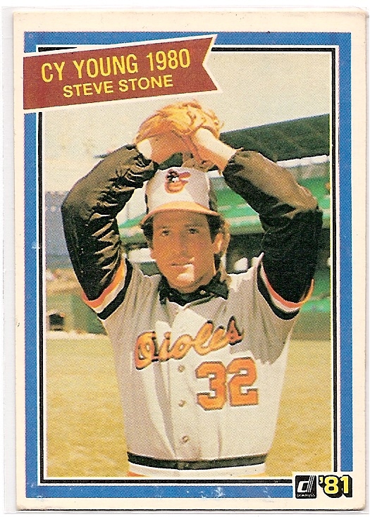
The 1981 Topps set is a tough choice for first, mainly because the whole decade feels about the same. You would think that competition with Donruss and Fleer would have Topps trying some new things with design, but they stuck with their guns through most of the decade, turning out set after set of cards that for the most part have the same basic feel (and I don't just mean the cardboard). The sets of the early 1980s are generally a blur. I didn't collect until 1989, so cards from 1985 and earlier weren't exactly accessible to me in larger quantities. Add to that some generally boring designs full of closed boxes and circles, and the sets just didn't catch my interest. But the 1981 set is one I like, because of one little thing - the ball cap in the bottom left corner. There's just something special about it. Though I wish they would have stuck the position somewhere else and used a team logo on the cap.

If I had been collecting in the 1980s, I would have probably been a Fleer or Donruss guy, because so many of these designs just run together - white borders, even more colored borders inside those, blocky designs, and no team logos on gray card stock in a time when the other companies were turning out bolder designs and fanciful borders that were unique from year to year.

What are your thoughts on my rankings? What are your favorite designs from the 1980s Topps issues? What designs do you despise?

Sunday, October 30, 2011

The Diamond King cards you didn't know about


I go to fairly extensive lengths to create my want lists. I do my best to be as complete and accurate as possible, spending hours researching Beckett and SCD guides, Beckett's website, and other online sources to come up with the best lists possible. I know my type collection list is always going to be out of date (even Beckett is several years behind on team issues and minor league sets), and sets and cards for the Women In Sports collection randomly appear from nowhere, through the expected major multi-sport releases, random team sets, and occasional insertion of a player or two.

You'd think for a release like Diamond Kings, it would be fairly simple. Diamond Kings were first issued in 1982, and there was a set made every year through 2005. Done. A Diamond Kings major release was done starting in 2002, with its own inserts to track. Done.

However, some cards fall through the cracks. I knew about the Hall of Fame Heroes set (seen on the right in the image above) fairly early, having picked up both the regular and jumbo-sized cards over time. A similar issue by Leaf was made in 1987, which I didn't know about until I found one at a card show a couple years ago. Donruss' kid-focused issue Triple Play sets of 1992 and 1993 had Gallery of Stars, which I knew about from opening packs in the early '90s.

Even after finding all these sets, I still discover new cards all the time. I found the Dave Stieb card above sitting in a dime box, and realized I didn't even know of its existence. And that got me thinking - what else am I missing like the Stieb? Are there other Leaf "Canadian Greats" cards I haven't checked into yet?

  • 1985 Leaf has the Stieb card shown above, #251, and Tim Raines, #252.
  • 1986 Leaf features Jeff Reardon, #214, and Jesse Barfield, #254.
  • 1987 Leaf includes Floyd Youmans, #65, and Mark Eichhorn, #173.
  • George Bell, #213, and Tim Wallach, #255, are in 1988 Leaf.
  • Along the same lines are the two King of Kings cards: Pete Rose (1986 #653) and Nolan Ryan (1990 #665).

So there are seven more cards I didn't know about! And that reminded me of the puzzle cards:


  • (1982) Babe Ruth (no card issued)
  • (1983) Ty Cobb #653
  • (1983 HOF Heroes) Mickey Mantle #43 (in HOF Heroes set)
  • (1984) Duke Snider #648
  • (1984 Action All-Stars) Ted Williams (no card issued)
  • (1985) Lou Gehrig #635
  • (1986) Hank Aaron #602
  • (1987) Roberto Clemente #612
  • (1988) Stan Musial #641
  • (1989) Warren Spahn #588
  • (1990) Carl Yastrzemski #588
  • (1990 Leaf) Yogi Berra (no card issued)
  • (1991 Leaf) Harmon Killebrew (no card issued)
  • (1991) Willie Stargell (no card issued)
  • (1992) Rod Carew (no card issued)

The puzzles themselves are not too expensive. You shouldn't pay more than $2 for any given complete puzzle (including the Ruth set)! The card numbers refer to puzzle images included in the named set - so even if you don't want the puzzles, there are base cards in the set that picture the art.

While the above aren't exactly "Diamond King" cards, they're all Donruss sets featuring the artwork of Dick Perez, which means they count in my book for the collection.

It's always fun doing research!

Awesome Vintageness Rules Again!

Maybe you missed my post about some Hank Aaron vintage:
Or the post about this card, and about 300 others like it:
But if you can't tell, I had a great time with vintage last weekend. I found a bunch more at the card show:
 1970s-style Hall of Famers! Torre had an accomplished career as both a player and a manager, and I don't see why he won't be a Hall of Famer.
 Look, ma! Tons of autographs! I got Hank Aaron and Juan Marichal and Dusty Baker an Johnny Bench and Pete Rose and... Sure, they're not as rare as the blue 1973 checklists and some of them are marked, but these cards must have been as cool to a kid as those team-signed facsimile baseballs you can buy at the stadium, or got for free when you filled up your gas tank at Chevron.
 1976 may be the next "vintage" set I try to complete, whenever I finish the 1973 set. But then again, I may try to just pick up a complete set of each of the post-1975 issues and focus my time on the tougher sets. Most of the 1970s designs aren't exactly inspiring. I like the little position guys in the corner of these cards though. And the use of team colors in the borders and bottom.

 I guess 1966 wasn't too interesting, either. But there are more sets with character in the 1960s than the 1970s, plus the '60s sets are a bigger challenge to put together.
 Everyone loves the 1971 set. I do too, even with a giant crease down the middle. Hey, every card from the red checklists to here were bought for ten cents each. I'm not going to be too picky at that price.
 How about this 1957 Topps Mickey Vernon card? Sure, someone attacked him with a red crayon, but for 50 cents, he's the first card toward the 407 card set. Only 406 to go! Maybe I'll find the other Mickey for 50 cents too. Yeah, I'm not holding my breath.
 This is a nice '58, other than the pen mark by Frank's ear.
 These '59s are in a bit rougher shape, but I'm happy with them!
Now, these 1956 cards aren't pretty. Nelson's fading away like a Derek Jeter autograph on a 1999 Topps HD card. But they're fairly intact and appreciated by me enough that 50 cents each was a decent deal!

I hate repeating myself, but it's so true: I'm really excited to be actively collecting vintage cards. For the longest time, vintage meant pre-1988, because I rarely saw those kinds of cards for sale as a kid (I never went to shows until I was an adult). Now that I can find pre-1980s cards (and at great prices) at shows, I'm picking them up for when I can finally devote my time and resources to completing each set. It's a lot of fun finding these cards.

I mentioned above that I'm working on the 1973 set, though all my base set lists are updated with the cards I currently own for each issue.

Saturday, October 29, 2011

Everybody must get (Steve) Stoned!

In case you don't get the topic title...

Steve Stone was a decent pitcher in the 1970s, striking out a good number of batters and keeping hits down, and as a result had a pretty good career. In 1980, he changed his philosophy and pitched to win, using his curveball as his main pitch. It worked - he went 25-7, with a 3.23 ERA and 149 strikeouts. That was good enough to win the Cy Young Award that inspired this card, although his dependence upon curveballs ruined his arm. He retired after the 1981 season, but went on to be a Cubs broadcaster, and he is now a commentator with the White Sox.

You may remember this from 2010 (good stuff starts about 2:10 in):
And here's Steve's response (I wish people would capture video instead of recording their TVs with their cell phones):
And here's something kinda funny from the whole thing:

Wow, more videos than card images. Fabulous!

A quick pimp for the bottom of the post: Derek of Tomahawk Chopping is doing a $15 trade draft, which gets you 25 inserts/parallels plus two hits. Not a bad deal if you ask me! I'm in. Are you?

The Gold Label of baseball cards

These cards are pure beauty. They have a great shine from the foil background that doesn't darken or bleach away with lighting changes or scanning. The two player photos are crisp, and the team logo is colorful and vibrant. The background is generic enough to be unobtrusive yet still attractive. It really stands out as a terrific card. Though I can't understand why Dante Bichette is standing in front of ivy in his home uniform.

I picked up a large lot of these - all the others are below, and this represents the start of my collecting of the set. I didn't pay much attention to the cards, and ended up with doubles, triples, etc. of many of the cards. I'll be tossing them into the clearance stacks as I work through them.


A quick pimp for the bottom of the post: Derek of Tomahawk Chopping is doing a $15 trade draft, which gets you 25 inserts/parallels plus two hits. Not a bad deal if you ask me! I'm in. Are you?

Friday, October 28, 2011

It's not just any checklist... (Plus, Alanta I need your help)

First, a quick request: dayf announced the Freedom Cardboard show is this weekend and Otis Nixon is signing. I've wanted his autograph for a long time and it's free, so if you're going i'd love to work out a trade - card, ball, photo are all good. Now to the post...

I can't say enough great things about the 1998 Pinnacle set. Look at the beautiful photography here, with all the NL all-stars lined up along the first base line. There sure seem to be a lot of Braves jerseys in there - you can thank Bobby Cox and the NL Champion Braves for that. Chipper is easily discernible with his number 10 and black socks. Eventually I will bother putting this set together, but for now, I pick up great cards here and there. I have an excuse for this one - since it features the stadium so prominently, I can use it in my awards/leaders collection to honor the Indians streak of 455 consecutive sellout games - that's nearly six years of full seats. The record was set in 2001 when the Indians finally had some empty seats, and it was passed in 2008 by Fenway Park - their streak currently sits at over 700 games. But with a rabid fan base, a classic park that tourists travel the world to see, and a small number of seats to appease the demand, it's easy to see why the Red Sox hold the current record. The Sox streak started in 2003, and certainly hasn't been hurt by the postseason push the team makes every year; Cleveland saw a similar surge when their streak started in 1995. Remember when the Indians were World Series-worthy?

Can anyone identify all the jerseys there without looking at a roster?

A quick pimp for the bottom of the post: Derek of Tomahawk Chopping is doing a $15 trade draft, which gets you 25 inserts/parallels plus two hits. Not a bad deal if you ask me! I'm in. Are you?

Hammerin' Hank

Yesterday, I showed you a great 1973 Ruth/Mays/Aaron card as part of a fantastic stack of cards provided by Jim. But I picked up another Hank Aaron a week ago at a local card shop.
It's his 1971 Topps card, and while it's certainly seen some wear, it's quite intact and I feel like I got a decent deal at the shop, spending only $10 (it books for $60 in NM condition). This was my first visit to the shop, mainly because I didn't know it existed until last week, and it's a good distance from my house in a direction I don't usually go.

Still, a great card, and a good shop!

Thursday, October 27, 2011

You can't get the best of ...

That was a great game six. I don't care how disinterested you may be in game sixes, this is one for the ages. The Cardinals fighting hard to stay in the series, the Rangers battling hard to win it all. The Cardinals held the lead only once, though they came back to tie it so many times more, and how about the bottom of the eighth and bottom of the ninth? And the bottom of the tenth?

See you tomorrow night, Cardinals.

Women in Professional Baseball: Jackie Mitchell

I found this card at the show last weekend, and had to have it. It's from 2009 Obak, and features Jackie Mitchell.

Mitchell grew up around baseball, being tutored by her father and later Dazzy Vance (yes, Hall of Famer Dazzy Vance). In 1931, she played for a woman's team and went to a special baseball school (do they still have those) as a teenager, where she was offered a contract to play with the Chattanooga Lookouts (AA level).

The Yankees came to town a few days later, and Jackie was brought in to face Babe Ruth, striking him out on four pitches. Gehrig was next, and she struck him out on three straight. After walking Tony Lazzari, she was taken out of the game.

Commissioner Landis voided her contract and essentially banned women from playing soon after, saying the game was too tough for women. Women were officially barred from the Major Leagues in 1952, until the 1992 draft of Carey Schueler.

She joined up with a barnstorming team for a while before becoming an optometrist, though she'd play a few more games here and there. She refused to play in the AAGPBL.

What makes this Ruth, Mays, and Aaron card so important?

 It's card number one in the 1973 set. It's one of the key cards to the set, and features three of baseball's greatest hitters. Take Mr. Steroids out of the picture, and you still have the all time home run leaders, just in a different order.

But that's not all that's important: that card was one of hundreds from the 1973 set given to me by Jim - who started out as a local reader with some cards for my collection and is now a friend. We've met up a few times now and it's always great to get together with him and talk baseball and cards.

You want to know how many cards he sent? See the image below:
I don't know how I'll ever repay you, Jim, for this *awesome* stack of cards. I believe that comprises about 30% of the set. So thank you again!

Wednesday, October 26, 2011

The Ugly: Panini Beware

It's been a while since my last post in this series, but it's almost done. I'm not sure it has much interest anyway, but I'm going to finish it up, for better or for worse.

I want Panini to succeed. I realize that so far this year, there are just over 30 baseball releases, most by Topps, with a handful by ITG, Leaf, TriStar, and Upper Deck. If Panini eventually acquires an MLBP license, that number can jump to 45 or 50. But I believe competition in the card market can be good. Topps seems to be falling into a little bit of a lull, and most releases have one of two feels ("vintage" or "high end").

But Panini must be mindful of the consumers and other manufacturers in the baseball card market. Collectors are throwing heaps of praise to Leaf with their choices in manufacturing (reducing cases and upping hits without changing price), set design (Crusade), and providing images of the high-end cards (Ichiro patch autographs are all cataloged and scanned). While I enjoy most of Topps' releases, I voice my thoughts in hopes that they somehow are heard and considered, and I know others do the same. Panini has provided some great insight into the company with their blog, but there are complaints that, if carried over to baseball, will seriously hurt their chances of getting a full license to use MLB logos.

The biggest issue I hear about deals with redemptions. I'm not sure if many of the issues have been corrected, but the mere inclusion of redemption cards can hurt a product. The complaints about Panini are not that redemptions are inserted, but that cards are often replaced for various reasons. If I pull a redemption card for a Nolan Ryan autograph, I expect a Nolan Ryan autograph. Many collectors buy redemption cards online because they want the player promised on the card, and not being able to follow through on that guarantee is a big negative. You know this already, but hopefully Panini has got the picture.

I've also read about issues with autographs and patches being wrong - upside down, crooked, etc. I know Topps has similar problems, but when sticker autographs are already ugly, a crooked, incorrect, or upside down signature is horrible.

The other just-plain-ugly part of Panini is the design of many of the cards.

To the left is 2005 Donruss Champions, and it gets my vote as the absolute worst design ever used on a base card. When the card designers make the relics and autographs the focus of the layout, the card set fails to get my interest.

On the other hand, when the autograph or relic just blends into the design, the card can be quite attractive:
I believe that's an on-card autograph, which is even better, but the design is solid, and while there is space at the bottom of the card, it's not a large space that's obviously left for an autograph. (I would enlarge the photo a bit to go behind the text just a little and stretch closer to the bottom of the card, but if there is a baseball set similar to this set, I'll collect it.)

Panini's Return to Baseball:
  1. Panini Swings the Bat
  2. Coolness on Cardboard
  3. The Good
  4. The Bad
  5. The Ugly
  6. My Own Set

2012 Topps Opening Day: Preview and Comments

The World Series wasn't even half over Friday when Topps was already looking forward to 2012 Opening Day - the set, that is. They released preview images from the annual budget set and set details to the public.

As expected, the 220-card set will look like the flagship issue without the foil. The blue bordered parallels return, serial numbered to 2012, according to the Beckett article.
 The one-per-pack inserts include Elite Skills (30 cards), Dream Team (30 cards), and the return of the 3D set Opening Day Stars (25 cards), Superstar Celebrations (30 cards), and Mascots (30 cards).
Printing plates and autographs return as the hits of the product. Ten younger players will sign, including World Series participants Neftali Feliz (seen below), Mitch Moreland, and Jon Jay.
 I'm happy with the 2012 flagship design, and as such the Opening Day design is acceptable. I'm looking forward to seeing the insert designs that haven't been released - the Elite Skills set (below) isn't my cup of tea, and neither is the Superstar Celebrations insert. However, I always enjoy 3D inserts, and Dream Team can have some promise.
Many people dismiss Opening Day as a cheap castoff, and it's true it's inexpensive, but it's a set that sells consistently through retail, for kids, casual collectors, and impulse purchasers. Because it is essentially a partial parallel of the flagship brand, it's a way for those who don't have the interest or budget to put together a full 660-card set to collect something each year.

I have one problem with the set, which I've voiced before, and I'm not the only one. Because the set simply reproduces part of the flagship set, it doesn't hold anything special for regular collectors. While I don't want Opening Day to reach its end, I would enjoy a set with a design geared more towards kids and families. A return of the Bazooka line is my answer, with more color to the base set design. Think 1992 Topps Kids, or 1993 Fun Pack. Yes, they're loud, but they're fun and entertaining. Topps Kids had great cartoons, while Fun Pack had all kinds of interesting subsets that included stickers, scratch-offs, glow in the dark cards, and "educational" cards to teach some of the finer points of the game. Yes, that's an Upper Deck product, but Topps has done cards similar to that in the past, and for a set that is geared towards collectors with lower budget, the product should be fun. Many of the insert concepts are fine, but need to be ported to a design that is more fun. Bazooka Comics was a great insert set, and most of the relic sets in Bazooka releases followed a comic panel style.

Opening Day is successful, mainly due to its price point. I believe it would be even more successful if it had a more exciting design with a bit more thought given to the insert sets. I know if it was a "unique" release, instead of a parallel of the flagship set, with a fun, playful, vibrant design and captivating inserts, I would buy more than a light selection of packs and maybe try to build a full master set. It worked for Panini with Score, so hopefully Topps will eventually take note and catch up in 2013.

What are your thoughts on Opening Day? Do you collect it? Do you buy any of it? Why or why not? Would any of my recommendations above increase or decrease your interest in the set?