Chaos and Kanji is the blog where I write about my adventures through Japan!

Want Lists are located here. NPB Baseball Want List is located here.

Thursday, March 30, 2017

Signing On to Another Mini-Collection

Things happen.

For the past couple of weeks I've been working a new schedule, which is messing with my concept of a week. I'm really excited to be on this schedule for what seems to be a few months, because it'll open up some opportunities that I haven't really had yet. But I'm losing track of what day it is.

With this new schedule, I won't be able to go to the card show in a couple weeks. It's supposed to be a smaller show, but I was looking forward to finding some good stuff from dealers I never see. So instead, I've been poking around auctions again, picking up nicer things here and there.

One thing I've been exploring is Japanese Woman's Pro Wrestling. I started with the 2017 True Heart set, what must be a fairly comprehensive collection of active wrestlers. And from that, I've been branching out into a handful of autographs. This isn't my entire collection - I dive head-first into many things - but it's a glimpse of what I have so far.
 Let's start with Moeka Haruhi. She's a model in addition to being a wrestler. I'm guessing that many of the "cuter" members are in wrestling more for the exposure than because they like wrestling. Or have at least used their cuteness to branch out into modeling or other fields.
 This woman's name is Glico. Well, "Guriko" with the kanji for kid as the ko. Glico is a snack brand here in Japan, so I'm sure the name is related.
 See what I mean about "cute" girls? Kyuuri is a teenager (she turns 19 at the end of May) who dresses up like vegetables. According to her Japanese Wikipedia page, her costume is part cucumber and part celery.
 Kuroneko means "black cat" in Japanese. That completely explains the costume, pose, and drawing of a paw print with her autographs.

I haven't just been focusing on wrestling. Actually, there are very few autographs in all that I'm chasing, but I've made some great strides in other areas of my Women-In-Sports collection.
 I've picked up a couple baseball autographs lately. Minami Takatsuka is still playing in the JWBL as far as I can tell. I didn't check this year's rosters but she was active at the end of last year.

I've been debating whether to try to collect the autograph set from this year's Epoch JWBL set; it won't be easy, with nearly 80 cards. At 500 yen ($5) each, that's 40,000 yen ($400). And I won't be getting all of the autographs for that cheap. One particular card seems to regularly sell for $200, and a couple other superstars are pricey as well.
 Oh, by the way, here's an American card. I haven't shown one of these since, what, this year's flagship Topps packs hit shelves? Dickie Joe Thon. What a unique name. He is the son of Dickie Thon, the former shortstop of the Astros and a few other teams around the 1980s. Dickie Joe played in Dunedin last year, which doesn't sound too promising for a player in his sixth professional year.
 Okay, back to Japanese cards. This 1984 Calbee card (Kazuyuki Yamamoto, #695) has a nice Victory symbol, though the Tigers didn't have much success in 1983. They did go on to win the Japan Series in 1985, though. Expect to see this card again when I get back to Calbee set posts.
This 1988 card was an "oops" purchase. But that's okay because it's a good image of Masato Yoshii. I'll find a good place in my collection for it anyway!

My apartment is a mess right now (there's a lot going on!), so I might be taking a few days off from posting to get caught up on things. So, until then...

Tuesday, March 28, 2017

Baseball Menko Madness: Face Not Included

 Another lot of menko cards have made their way into my collection! The first set have no player images. Instead, a colorful banner with the player's name takes up most of the card, with a silhouette of a baseball player and various shapes surrounding it. The player's jersey number is included on thef ront. The players are as follows (left to right, top to bottom): Masayuki Kakefu, Yutaka Takagi, Suguru Egawa, Sadaharu Oh, Masaru Uno, Katsuhito Mizuno, Sadaaki Yoshimura, Daisuke Araki, Hiromitsu Ochiai.

The photo-less cards are similar in concept to the 1988 IFT Strike/Ball/Out set, including some of the design elements found on the back. These are definitely not from that set; however, these cards were produced by IFT.

The remaining two cards come from another set, the c. 1973 Thick Menko (JCM 15b) set. The Giants player is Toshimitsu Suetsugu (again!) and the Carp batter is Koji Yamamoto.
For the IFT set, backs have a collection of things for use in games. A play of some sort is described at the top, including "slump" "sign" and "changeup" so it's not playable like a baseball game. Each of these plays has a corresponding point value, which is described in the text and in the large baseball. Next to the baseball is stylized text which says (on my cards) "home run", "hit", "triple", "out". I only have one "out" so it looks like this game could go on for quite some time. Below that text, a position (shortstop, pitcher, right field, etc). The bottom row has a random dice roll, line art of a plant, and a janken symbol. A copyright line identifies this set as being produced by IFT.

Like other c.1973 Thick Menko cards I've shown, these Type I backs are unrelated to the fronts. Engel doesn't mention back colors, but I think it's worth mentioning that I have both a light blue and black back here.

Since I'm a big fan of art cards, I like the IFT cards, despite (or perhaps partly because of) their simplicity. I wouldn't mind putting together a full set - if IFT used the same checklist as their JCM 19 set, there are 42 cards. IFT issued three sets which are cataloged in Engel's book, and I wouldn't mind having all three. But for now, I'll just add these in to my type collection.

Monday, March 27, 2017

This Baseball Card is for the Dogs

A couple days ago, I mentioned that gimmick card with the squirrel. You know the one. Or if you don't, go back and read my post from two days ago!

Not quite a gimmick, this card features an actual canine on duty in Hiroshima.
 The Carp had a ball dog named Mickey who was trained to carry a basket to the umpire and back to the dugout, and was definitely a crowd favorite. He passed away in 2009, but not before he had his own trading card. This card appeared in 2005 Calbee's second series and carries a premium over the other cards in the entire set.

A variation exists for this card. A standard card back (instead of a checklist back) was made for cards distributed at a Carp game during the 2005 season. That card carries a premium as well; I've never seen one but it remains on my want list for my Calbee type collection.

Sunday, March 26, 2017

Blog Bat Around: The Toughest Set

This is a response to Nachos Grande's Blog Bat Around.

I have a lot of complete sets. Not counting flagship sets, there are 540 records in my database: inserts, subsets, and full sets like Goodwin Champions and Allen & Ginter.

The want list is pretty big, too. 149 sets await their completion on that list, dating back to 1982. Many of the "older" sets from the 1990s have proven to be pretty difficult to finish, but living in Japan I have a limited access to trading cards. If I could go to local card shops and shows and focus on finding these cards I'm sure I could. Or if I spent more time (and money) on eBay. Or pulled the trigger on COMC or Sportlots. There are so many elusive cards.

I thought about sets I've given up on for this post.
2009 Upper Deck 20th Anniversary Retrospective - [Base] #1 - Ken Griffey Jr. - Courtesy of COMC.com
The 2009 Upper Deck 20th Anniversary Retrospective comes to mind. With 2500 cards, the set is massive, and finding those cards is impossible in Japan. I haven't given up my cards yet, though, and I might return to it if I come across a big lot to get me close.

At one point I had all of the Fleer team logo sticker sets on my want list. I didn't get a single card, but that was due to a lack of effort. This is another "collection" that I could add back to my list at some point in the future.

There are countless insert sets I've abandoned, some without even starting. 1998 and 1999 Upper Deck Retro lunchboxes, 1999 Topps Nolan Ryan refractors, 2003 Patch Collection, Sweet Spot and Sweet Spot Classic patches sets, 2004 Upper Deck Vintage 3D Sluggers.

Some base sets have been started and given up: American Pie, All-Time Fan Favorites.

I also considered the sets that I doubt I'll ever see completed. I wanted to build the 1948 Leaf set. 1952 Topps is probably never happening. I'll be surprised if I ever get a 1960s Topps set completed. Granted, my priorities are elsewhere right now, on the easier parts of my collection to obtain.

So I looked to my Tricky 10 want list.

Runner-up would be the 2012 and 2013 Triple Play sets. I don't really search as much as I should, and I could probably finish both of them with a bit of effort. I need the pants from 2012, and the batting gloves from 2012 and 2013.
2010 Upper Deck - Retail Exclusive #R3 - Shoeless Joe Jackson - Courtesy of COMC.com
But what I consider the most difficult is the Retail Exclusives insert set found in 2010 Upper Deck. They are a continuation of the SP cards from the 1990s, which were all the rage when I was a younger collector. Do you remember the Michael Jordan SP? Or maybe the Mr. Baseball SP with Frank Thomas? The 2010 set had Pete Rose, the Yankees, Shoeless Joe Jackson, and Sarah Palin. Considered extremely rare, I have the Rose and Palin cards, but not the Yankees and Shoeless Joe. While my SP set is complete, I don't consider the collection to be finished without these four cards. So two remain.
1996 SP - Baseball Heroes #85 - Chipper Jones - Courtesy of COMC.com
Perhaps the real question is this: Will I finish the Retail Exclusives set before I finish the Upper Deck Heroes set run? There are five sets in that run I have yet to finish: 1996 and 1997 SP, 2002 Authentic, the 2005 full set, and 2006 Authentics. Any one of those sets may prove to be more challenging than the Retail Exclusives set when it comes down to the final card or cards.

Saturday, March 25, 2017

Card Collecting: The Worst

Big Chips... eh, Nachos Grande recently asked the question: What's the worst part about card collecting? This isn't really a blog bat around (that comes tomorrow), but I figured I should chip in my two cents.

First, El Grande listed off a few things that could be pet peeves, so let's address those.

2001 Topps Heritage - [Base] #405 - Mike Piazza - Courtesy of COMC.com
Short prints. I am a multi-faceted collector, with sets being one of those. Short prints can be very irritating, depending on their rarity and complication. Really, when push comes to shove, aren't all inserts and hits short prints? What once were subsets nestled within the regular base set are now shiny rarities printed in limited quantities. I guess since they generally are numbered separately from the base set most people forget those. Anyway, I ignore short prints in many sets; some of my complete sets have them, while others don't.

2012 Topps - [Base] #93.2 - Skip Schumaker (Rally Squirrel) - Courtesy of COMC.com
Gimmicks. I love gimmicks. But like short prints, they can't be impossible to obtain. A card of a squirrel? Okay, but I am not paying $100 for it. Variations? Okay, but I'm not paying $100 for them. If they're part of the base set, I can ignore them completely, since they don't fit in my type collection.

1989 Fleer - [Base] #616.1 - Bill Ripken (FF on Bat Knob) - Courtesy of COMC.com
Error cards. If they aren't real, don't they become gimmicks? Real error cards can be fun just for the novelty, but not the scarcity. I have one of the 1990 Donruss reverse negative errors and the "Rick Face" error card as well. Sometimes, I might chase errors or variations for a complete set, but I can pick and choose.

2002 Topps Total - [Base] #2 - Derek Jeter - Courtesy of COMC.com
Big and small sets. I love big base sets. I want sets with all of the players. Not every set needs 900 cards, but it is nice to have definitive records on cardboard. Topps Total was a wonderful thing, though since it didn't have a huge profit margin Topps dumped the concept after a short while. As for the smaller sets, I'm happy with the 400ish-card sets like Gypsy Queen and Allen & Ginter, and even the 100-200-card sets like Donruss and Goodwin Champions. Depending on the concept and the goal, any set size is okay.

1992 Topps - [Base] - Gold #1 - Nolan Ryan - Courtesy of COMC.com
Parallels. Okay, this one can be irritating. Much of Playoff's and Panini's products from this century have been overdone with parallels. At least one of Panini's sets has parallels, parallels of the parallels, inserts, parallels of those inserts, and variations of those inserts (number of players, relics, number of relics, autographs, etc) with parallels of their own. But other than my type collection, I can take them or leave them.

1989 Fleer - Team Stickers Inserts #ATL - Atlanta Braves - Courtesy of COMC.com
No more "premiums" in the packs. I do miss getting packs with team logo stickers (Fleer, Upper Deck), puzzles (Donruss), and... okay I can pass on the gum. Hey, why doesn't Donruss, which is a retro-based brand, have puzzles? Anyway, these kiddie things were fun, but have now been replaced with the inserts. What I really miss, however, are cards inserted in with food. I doubt we'll ever see tobacco with trading cards again, but I miss cards in cereal and candy. There has been some promise in this area, since cards showed up in pizza in the US last year, and with sausage here in Japan!

9-pocket pages. Yes, having too many types can make the OCD in me go off, but I managed. I generally stuck with the same type per binder, and along those lines, I generally got the same type most of the time.

No, those could be good or bad. But what really bothers me?

2008 BBM Tohoku Rakuten Golden Eagles - Shining Star #ES1 - Masahiro Tanaka - Courtesy of COMC.com
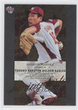
Well, I was going to go with meaningless insert sets. But it seems like Topps has been doing better with that; this year's flagship inserts generally have some sort of focus. In Japan, though, inserts are just shiny images of players on colored background with a remotely clever title related to the team's location, name, colors, or mascot. Each set here seems to have a set of 9 or 18 inserts just because they have to. But that isn't the worst.

No, it's the continuing movement toward a higher percentage of "hits" sets in each release.

My 2016 type collection list isn't 100% complete, but for the 43 base sets I do have recorded as being released, there were 273 parallel sets, 167 insert sets, 240 parallel sets for those inserts, 350 sets with hits (autographs, relics, manu-relics), and 1080 parallel sets for those hits. Plus an additional 25 oddball sets. So for the 2178 card sets I have recorded for 2016 so far, more than 50% are hit parallels. 2015 is only slightly better.

2015 Panini Immaculate Collection - [Base] - Blue #142 - Rookie Autos Blue - Buck Farmer /49 - Courtesy of COMC.com
The explosion started around around 2011, the year Panini returned to MLB cards. There's been a steady increase in the number of parallel hit sets, and in 2013 there was a massive four-fold increase in insert parallel sets as well. My type collection includes every single set ever made.

2016 Panini Donruss Optic - Rated Rookies Retro Signatures - 1984 Gold #84-MS - Miguel Sano /5 - Courtesy of COMC.com
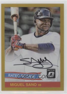
So not only do I need a 2016 Donruss Optic Rated Rookies 1984 Retro Signatures card, but I also need the aqua, black, blue, Carolina blue, gold, gold vinyl, green, hologram, orange, and red parallels. That's 10 parallels for one set. Repeat for 1985, 1986, 1987, and 1989. So Donruss Optic's five Rated Rookies Retro Signatures sets have 50 parallels between them.

Just as a comparison, 2016 Stadium Club, which is a similarly-priced brand (at least, MSRP), has a total of 33 sets. Total. With five autograph sets and six parallel hit sets.

2014 Panini Golden Age - [Base] #SP-84 - Jacqueline Kennedy - Courtesy of COMC.com
I guess I could say Panini is the worst part about card collecting, but that's not fair. I like getting the Donruss flagship set and Diamond Kings every year. There have been some intriguing releases in the past (Cooperstown and Golden Age, for example).

2016 Panini Prime Cuts - Timeline Quads - Gold #TQ-RM - Roger Maris /5 - Courtesy of COMC.com
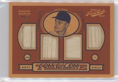
Unfortunately, since Panini apparently only really focuses on the high-end collector (Flawless, Immaculate, Pantheon, Prime Cuts), there's not much left for me to get behind. And with complicated releases with dozens of parallel hits, my type collection might need some rethinking. And that's what really bothers me. Don't get me wrong, Prime Cuts looks beautiful. But I can't afford to fill my collection with 1000 cards like this every year.

As an everyday collector, it's easy to ignore all of these parallels. Even as a player collector, I do that. For Jose Altuve, I just chase after his base and insert cards, and keep parallels whenever they fall into my lap. But the completist type collector wants these cards.

Friday, March 24, 2017

NOT a baseball card: Baseball Japanicana

Americana. Things that define classic America. Apple pie, the blues, baseball.

Japanicana is, thus, the Japanese version of Americana. Classic American things done Japanese. In America, in the late 1940s through 1960s, the Golden Age of baseball brought about the Golden Age of baseball card collecting. Across the Pacific Ocean, professional baseball was exploding in popularity along with a new youth base which wanted toys to play with related to their interests.

Enter: baseball kites. Very thin paper with small sticks to hold them in a flag shape.
You can see the sticks through the paper, it's so thin,. These were probably designed to fly like real kites. But given their small size and fragility I don't think they would have been very good. Instead, they do hang on a wall very well.
There is a long string coming from the middle, around the face, which secures the paper to the support stick, which would make it more durable in flight. And since kites have long strings to fly in the air, this string was either probably much longer or tied on to a long string to make a functioning kite. I took a fairly close-up picture, but the red streamers at the bottom continue on for a decent length, perhaps twice as long as the main body of the kite. And they are rainbow colored, going ROYGBIV in order.
Even Santa Claus had to get in on this party, though here he looks a little more like a sad old Asian man than jolly old St. Nick.

I really didn't know what I was getting when I bought these off YJA, as I got them from the same seller as the last two menko sets I posted about. I thought they might be some sort of die-cut menko, but these are so much cooler than most menko.

As usual, I don't know anything else about them - issue date, original cost, etc, so any information is gladly welcome!

Thursday, March 23, 2017

Baseball Menko Madness: Full Set!

Are you sick of seeing cards of players I can't identify on cards that are uncatalogued? I'm not tired of researching them, but today's menko set - the last, I think, for a little while at least - is cataloged. (By the way, cataloged, not catalogued. Uncatalogued, not uncataloged. Huh, spell-check?)

Today's menko cards come as a complete set. Identified as JRM 2, the set is called 1949 Starburst for obvious reasons: a yellow starburst is located behind each player's head. The cards are blank-backed and are considered pretty rare. They measure 1-7/8" in diameter.

Note that there are three variations of this set, all larger than my cards. Cards that are 2-5/8" (set 2a) are more valuable and include three variations (Betto, Kawakami, and Aota). 2b is 2-1/4" in diameter, and is considered extremely rare. Finally, set 2c is 3" in diameter and due to a recent find they aren't as valuable.

Since this set was printed in 1949, it predates the creation of the NPB, though as I mentioned yesterday all of the teams in existence in the Japanese Baseball League at that time transitioned over to the restructured league.

This "base" set is considered a rarity of R1 (250-1000 copies of each card), with singles ranging from $10-60 and a complete set listed at $300. I think I got a pretty good deal!

Here is my complete ten-card set:
Kaoru Betto and Henry "Bozo" Wakabayashi
Takehiko Bessho and Fumio Fujimura
Michio Nishizawa and Nobuo Nakatani
Shigeru Chiba and Tetsuharu Kawakami
Hiroshi Oshita and Noboru Aota

Wednesday, March 22, 2017

Baseball Menko Madness: More Uncut Sheets! More Uncatalogued Cards! More Research!

 The first sheet is uncatalogued, yet again. There's a reason for that, though: the fronts depict random players on each team, most likely. The text on the front is the team name.

  • Hanshin / Giants
  • Hankyu / Taiyo
  • Chunichi / Nankai
  • Kinsei / Kyuei
Kinsei was a tricky one for a long time while I was researching this post. And then I decided to look before the establishment of the NPB, and came across the Gold Stars, AKA Kinsei Stars (1947-48). The Stars would eventually become today's Chiba Lotte Marines.

And Kyuei fell into place soon after. This team would soon become the Toei Flyers, and eventually the Hokkaido Nippon-Ham Fighters. They were only called Kyuei Flyers for one year: 1948.

Therefore, this menko must be from 1948! All eight teams were members of the Japanese Baseball League, which existed from 1936 to 1949, before it became the NPB in 1950. During the 1948 season, there were eight teams, so all teams are represented here. And oddly enough, all eight teams that made it to the 1948 season (several teams in the league did not) still exist today (though with different owners in most cases). Again, that's pretty interesting, since several teams folded or merged in the 1950s.

I guess after all that I should talk about the back. Some crazy topless guy with long hair looks about ready to slap someone across the face. A batter is about to swing inside a baseball. A janken symbol is on the lower-left with a math equation at the bottom.

This second uncut sheet is not quite JCM 23. These, 1960 Playing Card Backs, aren't assigned a catalog number, but I've catalogued them as JCM 23b. My uncut sheet includes four TV stars in addition to four baseball players, showing that baseball and entertainment menkos were packaged and even printed together. Engel's guide recognizes this fact; some uncut sheets from this set have eight baseball players while others have four and four, as you see here.

Backs can't be used to identify the fronts, as it depends on the printing. And if you look at my example above, two pairs of cards share backs.

As for the baseball players, the top card is Eiji Bando with an unknown pitcher, next is Tadashi Sugiura with an unknown Hawks player, followed by Toru Mori (both images), and at the bottom is most likely two unknown Orions players (unless it's Sadaharu Oh with a pitcher; the image isn't that good).

Tuesday, March 21, 2017

Baseball Menko Madness: Uncut, Uncatalogued

True, I'm finally finished posting that massive mess of menko minis. But that doesn't mean I'm done showing vintage beauty.

I pick up menko in spurts. From time to time, I find myself with free time while I'm commuting. I've scrolled through Facebook, checked out my blog feed, and used up all of my hearts in Tsum Tsum. So I start poking around Yahoo Japan Auctions. I find a few menko listings and get what I can, and forget to keep an eye on listings for a while. Then, I have some more free time on the train, and the cycle begins again.

This uncut sheet probably dates back to the 1940s:
The menko are all intact on their sheet and feature crude drawings of various baseball players. I'm guessing that the logos on the jerseys are either generic or related to universities. The backs are blank.

Keio seems to be the name on the jersey of menko 6534, and the large character on the flag in 3534 is the first kanji in Keio. (Why is a player with an A on his cap holding a flag referring to Keio University?) The remaining characters refer to nationwide something-or-another. Keio University has a very popular baseball team and is a member of the Tokyo Big 6 Baseball League. Post-war, they dominated the Big 6 league in 1946 and 1947.

T could be Tokyo, or any other number of universities. But I don't know what R and A refer to. Furthermore, one of the "K" capped players has what looks to be Kokura on his jersey (the small unnumbered menko at the bottom).

Along those lines, T could be the Tigers on at least one of the cards. The uniform designs change from card to card, so each card could represent a different team. On 4571, a "T" player seems to be on the field with an "A" player. Though "A" could be a base runner. Then again, there's no guarantee that the two images are supposed to go together at all, and instead could just be two players or teams.

Kokura is a city in Kyushu prefecture, or at least it was, until it was joined with another city in 1963 to form Kitakyushu. But a very basic search didn't bring up any information on a Kokura University. Kitakyushu University seems to have been founded in 1946 but doesn't appear to have operated as Kokura University. The "Kokura" could refer to a high school team. A separate listing for this same sheet on YJA refers to high school baseball.

The star mark says 王元 Oogen (former king, or original king, or something to that point, based on what I can figure.)

I figure this is the from the late 1940s given the style. Round menkos were most common from around 1946-1950, Keio University had a strong baseball team around that time, and the crude drawings match up with other menko issued around that time. Furthermore, I've found some hints from other sites that Nukitori menko date back to the 1940s and this basic die-cut template was probably used multiple times.

Aside from that one menko with the flag, though, no other evidence shows that these menko are actually related to any particular team, and could just be random baseball art. Thanks to the heading, at least we know they're called "Nukitori Menko".

Art menko are my favorite. The drawings may be pretty simple here but that is part of the appeal. And while it's not too big (about the size of an Allen & Ginter box topper) it can look nice displayed on a wall!

As always, any other information is welcome!

Monday, March 20, 2017

Menko Madness: Finally, the Baseball

And you only get two scans.
 While I'm not surprised, the baseball menko I ended up with weren't necessarily really old or rare or anything along those lines. Yes, they are vintage, and I'm really glad to have them! However, finding menko from the 1940s or 1950s was out of the question.
The backs are here, so this is where you start when it comes to identifying menko. The top-left image (4985023) corresponds to the top-left image for the front scans, so let's get to work.

4985023: At first I believed this was from the 1972 Kankan Menko set (JCM 15a), however, the front image points to it being from the 1973 Thick Menko set (JCM 15b). That said, the description for set doesn't recognize this back (two cartoon characters opposing each other). Therefore, I believe it to be a third type, with the cartoon character backs. The player on the front is Shigeo Nagashima, one of the key cards in the set. (Based on the descriptions of Nagashima's cards in 15a and 15b, I believe it to be the 15b card. However, it could be the "headshot" or even "batting" pose for Nagashima in the 15a set. See how difficult this is?)

1750740: This card has the same back style as the Nagashima card, but the front is definitely a colorized image that matches up with the JCM 15a set. Therefore, this is a JCM 15a card of Minoru Murayama, with Toshio Kanbe in the background.

80620: This card is definitely from the 1973 Thick Menko set, and features Toshimitsu Suetsugu. The back is identical to the JCM 15a Type I style, making this a Type I back for JCM 15b.

90001: Marusan issued a bunch of very similar cards around 1960-1964 or so, but given the information on the front, this is from JCM 11, 1964 Marusan Simple, Navy Blue Back Photo Menko. Cards from this set were imported to the US, and those cards have a stamp around the janken symbol with a card number. This particular card stayed here in Japan. The player on the front is Kent Hadley, and this is one of only two menko sets (and thus Japanese sets) he appeared in!

The blue-backed one: Not really a menko card despite its appearance, this thinner stock card was issued by NST as a parallel to JMC 40: 1978 NST Yomiuri Giants. The regular cards in this set were meant to be pasted in an album, but these cards might have been sold as sets or given away as premiums/bonuses. I'm not sure who the player is.

I'm finally finished! But there are more menko to come. I have an uncut sheet and some other menko surprises on the way. But those are baseball menko. I promise!

Until then...

Sunday, March 19, 2017

Menko Madness: The End is Nigh

I'm glad to say that this post will finish off the non-sport side of the massive menko mountain that continues to haunt a corner of my room. And that just leaves baseball! That's not much, unfortunately, but they are nice.
 I almost put this one in the "well-loved" section (at the bottom) but it deserved its own post. Mighty Atom (Astro Boy) graces the back of this cartoon-fronted menko.
 The crazy sea-monster front is worth its own post. I don't know what that is in the foreground, but the the background image looks like a battleship sinking as it's attacked by another fighter jet. Is this a reference to Pearl Harbor?! The back has a robot shooting laser beams at poor unfortunate screaming kids. This is similar in style to other menko backs we've seen in this post run, though there are some differences, including the massively long menko number at the bottom. Note that this back is almost the same as baseball menko JCM 129, 1958 Mitsuwa War/Playing Card Backs. However, the printer's mark isn't in the playing card section. I've mentioned that a similar card looked like it's from JCM 141, 1962 War/Playing Card Back.
 I really wish I knew more about Japanese TV. Whatever cartoon is on the front looks like a genie using his garlic breath to fight off kids. The backs have war images in the lower half, and yes that is an atomic bomb cloud. I don't know the kanji there, though.
 The next one comes from another Japanese show, and the back here has a space theme. The kanji below it translates to satellite.
 This next image might be the creepiest. Though if you go back to the first post in this series you'll see a guy in bondage gear. The back is pretty non-descript, though the animal artwork in the middle is nice.
 Once again there is a series with one odd card out. Actually, there are three shows here that I can tell, Kamen Rider (outside cards), Ultraman (inside cards), and some anime in the middle.
 These menko backs have a lot going on. They all have main pictures featuring transportation. The Japanese text is related to the picture.  At the top is a directional hand, a baseball play (four ball [walk], ball, balk, etc), and a nature scene. And the bottom has a die roll, menko number, and janken symbol. I guess you could do about any game you'd like with these cards! Except for playing poker games.
 This next group is an eclectic bunch. The cards at the bottom all have the show's title on the front, while the vertical cards do not. One card has a silver border and is smaller in size than the others, too. But they all share similar backs.
 Colors are generally blue on the back, except for the smaller card. Some sort of military rank or a space theme makes up the picture, with the text at the top relating to that image. The manufacturer's mark is next to the menko number, which varies by card.
 Continuing with the same group, here are three more that didn't fit on the scanner.
 I'm curious if the space backs and military personnel backs are from the same issue or separate issues, despite the front images being from the same show.
 Once again I don't know what's going on on the front, and the back is quite busy as well. The text at the top says "rocket" in Japanese, but that looks like a robot to me. There's also a copyright symbol at the top, a janken symbol near the middle, and a manufacturer's symbol toward the bottom, above the menko number.
 The last main card group is this single card with the front and back of Japanese coins. The color side has the front of a 100 yen coin and the back of a 50 yen coin, while the green monochrome side is reversed.
 The card is miscut but neat. Actually, through all of this I've seen some menko cards I wouldn't mind having full sets of, like the money menko. Maybe I'll come across a bunch at a flea market someday.

To finish out today's post, here are some cards that were truly well-loved.
 All of these cards have only one side. The other side is completely mutilated or has been separated from this side. So I can only show this side of the card.
And whoever owned these cards made their menko stronger by taping some of them together in pairs or even threes. I found at least one menko trapped between two others.

So that's it for the non-sport. Baseball tomorrow, I promise!