Chaos and Kanji is the blog where I write about my adventures through Japan!

Want Lists are located here. NPB Baseball Want List is located here.
Showing posts with label donruss. Show all posts

Tuesday, March 16, 2021

2021 Donruss: Quick Thoughts and Variation Guide

 2021 Donruss has just hit the shelves, and I thought I would take a quick look at the set before explaining the variations. Why the variations? Because as I write this post, nobody has posted one yet. I'm sure Cardboard Connection and/or Beckett will have a full guide eventually, complete with photos, but for now, this might help set builders out there. (Perhaps by the time this goes live, there will be a better guide?)

The base set and its many parallels have a parallelogram design; the throwback subset at the end of the base checklist pays homage to the 1987 design. The borders are a bit bigger than I'd like, but with all of the emoji parallels, I suppose they need to be big. There are a total of 18 parallels, two of which are 1/1 (Number One and the four colors of Printing Plates). Of note are the mask emoji parallels, numbered out of 19 copies. I guess that's one way to recognize the pandemic.

The first thirty cards of the set are Diamond Kings, with the next 32 being Rated Rookies. Throwbacks featuring retired players are #213-262, with the final two cards going to the San Diego Chicken and Domingo Ayala. The DKs have a 1985 feel to them, and have the painted-style photoshop filter applied to them. I do miss hand-painted Diamond Kings.

As for inserts, most of the regulars are back: Elite, Dominators, Highlights, Rated Prospects, The Rookies. Livestream has nice photos but just batters swinging their bats. Trending is run-of-the-mill. Whammy is still fun, but remains tough as a case hit, and while the new Unleashed set has a great background, that same background is on every card. Of course, there are plenty of autographs and relics, with many using the 1987 design.

Thoughts? I don't see any neat inserts like last year's Division set. And as always, Panini pumps out the parallels. The set looks nice but there are no surprises, nor anything that stands out as a must-have. I'm going to go for the base set and a second DK set for my collections, and the type cards, and call it done; none of the insert sets make my want list this year.

Okay, let's get to the variations. There are a few types. The most obvious are player name or team name variations. Most of these switch out a nickname. There are some photo variations and a couple back variations to keep you on your toes. Here is the full list with what to look for (if you have any corrections, let me know).

Note: for variations other than names, I'll describe both versions of the card. As far as I can tell, variations aren't actually short printed. Also, some cards have multiple differences; I tried to use the easiest one to identify. If you have any corrections or other updates regarding this, let me know.

Regular Base Set

  • 67 "Yaz" nickname
  • 71 "Slam Diego" team name
  • 79 "Mini Apple" team name
  • 82 "Kestdaddy" nickname
  • 90 "Big Foot" nickname
  • 101 "Buetane" nickname
  • 105 photo variation: hands apart/hands together
  • 107 "Tony Two Bags" nickname
  • 130 photo variation: batting/throwing
  • 139 photo variation: batting/fielding
  • 143 "La Pantera" nickname
  • 146 photo variation: batting/fielding
  • 150 "Big Apple" team name
  • 154 back variation: between team name and game stats, spacing is either approximately "I" width or "A" width. This is a very difficult variation to identify! See image below.
  • 155 "Bamm-Bamm" nickname
  • 161 "Windy City" team name
  • 165 "The 6" team name
  • 170 photo variation: batting/wearing a mask
  • 172 "The Low" team name
  • 173 photo variation: batting/running
  • 174 "H-Town" team name
  • 182 photo variation: batting/throwing
  • 183 "Forest City" team name
  • 189 "Pico de Gallo" name
  • 200 back text: "ways" is either on first or second line
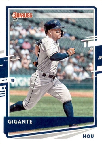
  • 202 "Gigante" nickname
  • 206 photo variation: black jersey/white jersey
  • 212 "Chef G" nickname
1987 Throwback Subset
  • 216 "Thomenator" nickname
  • 223 "Big Puma" nickname
  • 228 back text: "time" is either on first or second line
  • 235 photo variation: light jersey/dark jersey
  • 236 "354 Career Wins" replaces name
  • 239 photo variation: white jersey/blue jersey
  • 240 "Big Sexy" nickname
  • 247 "1406 Career Steals" replaces name
  • 253 "14x All Star" replaces name
  • 257 photo variation: closeup (no black between legs) or full body (black visible between legs)
I hope this helps some of you trying to figure out the variations for your sets!
The above image can be enlarged.

Wednesday, April 22, 2020

Thoughts on 2020 Donruss

What could be called Panini's flagship baseball brand came out last month (March 4). I get that some people automatically dismiss anything from Panini due to the lack of logos, but I've been collecting cards without logos since I was a kid.
The base cards aren't bad; the borders end up a bit large inside the parallelogram photo space; the design draws inspiration from the 1986 design. Throwback subset and parallels look even more like the 1986 set. Of course, Diamond Kings and Rated Rookies parallels kick off the set.

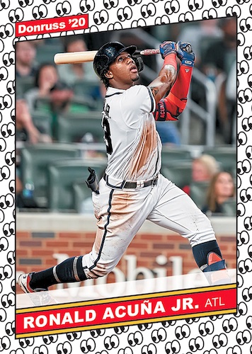
There are several parallels again this year, including the gimmicky emoji parallels. Honestly, I wish they would have waited until next year, when they do a 1987 throwback, since the baseball borders could have easily been replaced with emojis. I'm sure we can count on that, too, though. In all, I count 19 parallels (printing plates count all as one type of parallel in my book).

There are variations, too. And while nickname variations are easy to spot, the photo variations are also identifiable by looking at the back for the red Donruss logo, or a solid card number. I've never really cared for variations and there is an excessive number of parallels, though the emoji gimmick is a little fun.

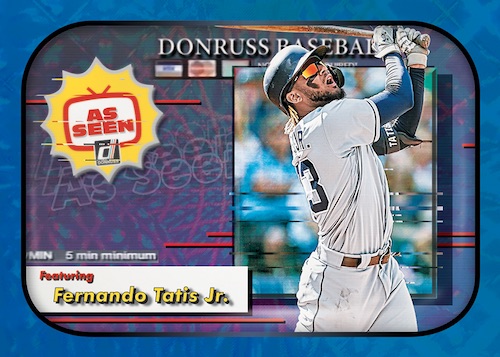
I do like some of the inserts. As Seen is a nice, unique idea. There are some typical insert sets: Elite, Rated Prospects, Now Playing (lost opportunity for movie theming), Dominators, and the 1986 Highlights throwback design set.

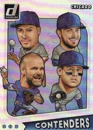
Whammy! is back, but at one per case they continue to remain outside of my price range. That's a shame, because I love art cards. The same goes for Contenders and Divisions. Contenders has the four teams which made it to the League Championship Series, and Divisions has a few stars from each of the six Divisions.

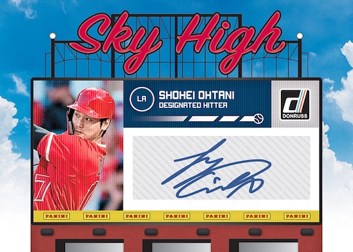
Classified Signatures is another unique idea for inserts, and I think the card design is very nice. It reminds me of the better inserts of the 1990s. Sky High Signatures is supposed to look like a stadium scoreboard, but I don't like the execution. Points for effort, though.

American Pride is back, highlighting USA team members. This time, they paired each active player with a former Team USA member who made it to the majors. I collect this set every year because I collect Team USA cards, though I could do without the multiplayer aspect.

There are some more insert, memorabilia, and autograph sets, but they are standard Donruss fare so I won't bother mentioning them.

With only 192 cards per box, it takes a lot to build a 300-card set with the variations. On average, almost every pack will include something other than a base card; three hits, 11 parallels, and five inserts can be found in each 24-pack box.

As always, I have a base set for my Donruss set run and a DK subset. I also want an American Pride set for their collections, and I'd like to put together the Contenders and DIvisions sets. I've already started working on the American Pride set.

What are your thoughts on Donruss? Would they be any different if Panini had a license to use MLB logos?

All images in this post are not my own cards.

Wednesday, April 4, 2018

Behind the Plate Plate

 I'm a bit surprised I got this card at such a low price. Sure, Gerald Dempsey "Buster" Posey isn't super-hot, but he's a Rookie of the Year and MVP, and a five-time All-Star, four time Silver Slugger, and one-time Gold Glove. In his first nine seasons, only seven of those being full seasons.
Of course, I'm not talking about some regular (variation) base card. I'm talking about a 1/1 printing plate. This card is headed for my type collection, but who knows? In 10 years, it might be really valuable. Or not. Time will tell!

I gotta say, though, for all the complaining people do about Panini and Donruss, I generally enjoy a few of their products each year, just like I do with Topps. That's a good picture, team colors are represented even though Panini can't tell you the team, and the design is decent. It's a little busy, but this isn't Stadium Club, so that's okay. I always look forward to Donruss, even with all of its faults.

Wednesday, March 5, 2014

2014 Donruss: An Outside Review

The return of Donruss for the first time in almost a decade was pretty exciting, when I first heard of it. Granted, even with the previews there was room for improvement, but as an initial offering it was a step in the right direction.
 I don't have any cards in-hand yet. I've been keeping an eye on eBay and some of the conversation on the blogs, though. I've heard a lot about collation, but that's not important to me because I never get a chance to bust boxes anyway. Since I don't have any cards in hand (I tried, really I did), I'll be using the original preview images and some others from around the web.
 I like the nod to the 1987 set with the baseball border. Those borders are thick, though - perhaps too thick. The base set has 200 cards, but only 155 of those are part of the regular set. There are two subsets that make up the first 45 cards.
 The set begins, as is tradition with Donruss, with 30 Diamond Kings cards. These are short-printed and fall four per box. The design is based on the 1984 Diamond Kings subset, but these appear to be photos with a "painted" filter. The other 15 short printed cards are Rated Rookies, which also fall four per box (and thus are twice as abundant). The Rated Rookies use the same design as the base card, with the addition of the classic Rated Rookie logo in the upper right corner of the card.
Thankfully, there are only four parallels in 2014 Donruss. And they are all attainable. There are two Press Proof parallels - a silver version numbered to 199, and a gold version numbered to 99. The only difference between proofs and regular cards is the foil on the front including the serial numbering.
The other two parallels are Stat Lines. There are two versions - season and career. They are identifiable by the foil stat on the front; Career Stat Lines show career totals, while Season Stat Lines show season totals. They are serial numbered to the statistic, up to 400 copies. Stat Line inserts also use foil card stock.

The Diamond Kings are also available as box toppers; a 25-card jumbo set is found one per box. This is not a parallel of the regular set, although some players appear in both sets. Signed versions of 24 cards are available. Not all 25?
Starting the insert list is Breakout Hitters and Breakout Pitchers. They are two separate insert sets and are numbered separately, but they have identical designs. The design is pretty cool, showing the player popping through a brick wall.
Next is Game Gear, the lone relic set. There are 50 cards in the set, which has a very simple but still appealing design. Almost all the cards in the relic set have a Game Gear Prime parallel version, usually serial numbered to 25.
 The main autographed set is simply called Donruss Signatures. There are 50 subjects in this set, too. And again, the design is simple but eye catching.
 The Elite Series makes a return, serial-numbered to 999 copies. As expected, these have a foil background and look pretty good. There are 20 cards in the set, 17 of which have autographed parallels numbered to 10.
 Also returning is Elite Dominators. This set has 30 subjects, numbered to 999, with 29 autographed parallels numbered to 10.
 Hall Worthy is a 15 card set depicting players on a plaque. Although some on the checklist should go first ballot (Mariano Rivera, for instance) others will have a difficult time reaching Cooperstown. I'm not sure how this looks in person - the preview images from Panini looked great but seeing scans like the one above doesn't impress me.
With a design that reminds me of 1991, just with more color, the No-No's insert set has 10 cards which feature specific no hitters. As you might expect, Nolan Ryan is part of this series, but so is Dwight Gooden and Homer Bailey. Some of the players on the list pitched perfect games. 
 The Power Plus set uses a 1985-inspired (remember those All-Star cards) border and a split front with two photos. Two photos plus a grid background makes the card feel somewhat busy. The regular insert set contains 12 cards, but the autographed version has 19 subjects, serial numbered up to 25 each.
 Studio is a reminder of the 1991 set, going back to the set's roots with black and white photos of players out of uniform. But I'm not sure it made it into packs. Panini first posted the white background Puig when it released information about Donruss, and in February it posted a bunch of images of black-background cards. However, I haven't seen them on eBay. Are these going to be used in the wrapper redemption? Beckett has a 12-card checklist in its database.
A set that reminds me a lot of my first collecting days is the 30-card Team MVP insert. They use the simple design of the 1989 Donruss set. It's not my favorite, by any means, but it is a usually pleasant design. Of course, if you have a dresser drawer full of them the design gets dull very quickly.
Last for the inserts, with a somewhat-1988ish border design, The Rookies is back in this 16 card set. It's not as true to the 1988 design as others are to their years, as the '88 set had horizontal and parallel lines with some black mixed in.
Beckett lists 39 different buyback autograph subjects that were randomly inserted in packs, appearing to be numbered between 3 and 86 copies each. 

Overall, I like the set. Let's face it, this is a throwback set. And I'm okay with that. I hope that in the future, Panini goes one of two ways. It can move forward, and turn this into its flagship baseball brand, expanding the size of the base set, but I would like for it to drop the throwback edge if they do. Or they can keep it as a throwback set, reusing or re-imagining old designs and keeping the set small. I'd hope if that was the case they bring back Score or another brand to create a full 600+ card set with purely active players. Actually, if Panini could secure an MLB license, that would be a great time to bring back Leaf for a high-quality photo based issue.

As for this Donruss issue, the not-quite-reprint throwback style works for my taste. I have the base set purchased already (without SPs). I collect Diamond Kings so those will be on my want list. It's probably going to be impossible to finish, but I'd like the box toppers too. Panini inserts are difficult to come by in Japan, otherwise I'd probably add several of the other sets to my collection as well! I am really hoping to find a bunch of these cards somewhere in my travels around Tokyo in the next few weeks.

Monday, January 20, 2014

I've Been Waiting: 2014 Donruss Preview

Let's round out a trio of 2014 previews with Panini's 2014 Donruss offering.
Coming next month, Panini is about halfway where it should be with the return of the Donruss name.
The base set will only have 200 cards. This isn't exactly a flagship release, and pushing it to 400 or more would be a much better idea. I'm sure all the big name veterans will be in this set, so if Panini wants to do a second series it will be lacking in star power, or have a bunch of the same players in both series. Perhaps next year would be a larger set.

Something Panini could do in future releases is push for the Topps Total aspect, and issue a card for all players from the 40-man roster, or everyone who had playing time the prior year. The 200-card set includes Diamond Kings (30 cards) and Rated Rookies (15 cards), so only 155 base cards will be issued. I like the look, though the borders seem a little large; 1987 Donruss is one of the set's most memorable designs.

As far as parallels, Silver Press Proofs, Season Stat Line, and Career Stat Line cards appear one per box. Donruss has included Gold Proofs in the past, and there is a possibility for other unannounced parallels to be issued.
 Speaking of Diamond Kings, I'm very happy to see these back. But I'm very sad that they aren't art cards. It's almost a sin! Dick Perez might be under contract to Topps, out of budget, or retired at this point, but could they find another artist? The 1984-series based design will also have box toppers and autographed versions. I really hope this will be an artistic set, so I can go after the box toppers. Otherwise, I'll grab the base cards of the subset, which appear four per box (of 30; that's 7.5 boxes to complete the set). Four Rated Rookies (of 15) will be in each box, too.
 Two Hall Worthy inserts will be in each box. I like the look of these, which obviously are patterned after Hall of Fame plaques in Cooperstown. Other inserts include The Rookies (2 per box), Breakout Hitters (2 per box), Breakout Pitchers (2 per box), Team MVP (1 per box), and No-No (1 per box). I expect these all to have parallel versions, though it would be nice if Panini kept things simple. There are already (at least) 10 base insert sets plus the two short printed subsets and all the parallels, relics, and autographs!
 Studio will return with black and white portraits, although odds haven't been announced. This could be the toughest insert pull in the release. I've never really latched on to Studio, though I find a lot to love about its uniqueness in prior years. Studio Heritage was one of my favorite insert sets to collect each year.
 Elite Series and Elite Dominators inserts will be #/999, and autographed versions will be numbered to only 10. I would love to put together a full series run of the Elite Series inserts, similar to my attempt to complete the Upper Deck Baseball Heroes perpetual insert set.
 Power Plus inserts fall three per box, and Panini released a preview image of an autographed version. The design harkens back to 1985, when Donruss issued a jumbo-sized Action All Stars set. The 1985 design is better, only because of the giant headshots instead of the split screen.
 Speaking of autographs, there are two in each box. Most box busters will probably find Donruss Signatures, which might come with parallel versions. It's a simple, clean design that helps the autograph stand out, and I like it.
One relic will come in each box, and those will be Game Gear relics. The design reminds me a little bit of 1982 Topps, but it is a nice throwback design.

Panini has done some things right. They're bringing back several recognizable series names and including a lot of classic designs. There are big names in the release - the sample relic and autographs are all pretty big stars. And depending on your tastes, the insert sets are collect-worthy, unlike most of Topps' predictable flagship insert offerings.

However, there are areas to improve on, even before the release; mainly, the base set is too small for a flagship and the Diamond Kings should be art. I could be speaking too soon on that aspect. By recycling old designs and old series names, Donruss becomes another Topps Archives. I think that the Score name could be brought back as an inexpensive flagship brand, though, and Donruss becomes a mid-level annual release. But, then Panini has Pinnacle, which did the same thing with a futuristic throwback feel.

There's no reason the sets can all coexist. Donruss covers the traditional flagship line, Score a possible budget line with Pinnacle being a more modern line. Prizm takes care of the Chrome route, and Golden Age is the truly vintage throwback set like Goodwin and Ginter. And then there's Cooperstown, which has a lot of potential for a few years (if they honor enough of the more obscure players, as they should) before it just really repeats itself.

I know I'm down for the base set and the Diamond Kings subset. We'll see what those inserts without previews look like!

Tuesday, October 4, 2011

Allen and Ginter, Eat Your Heart Out

After six years, I picked up my first Allen & Ginter rip card this summer, seen towards the bottom of this post. I remember when A&G first hit in 2006, there was a great deal of discussion about whether it was worth ripping the card. Along the same lines are the discussions on whether to peel protective coatings, open sealed vintage packs, or (for two years in the 1990s) open the cans.

But you may not be familiar with another "rip" card that came out nearly a decade before the first Allen and Ginter issue: Zenith's 5x7 cards. This set came three per pack of 1998 Zenith, with the regular-sized cards inside the 5x7s.
Of course, the Ginter rip cards are much more limited than these 5x7 cards, adding to their scarcity. And much like the Ginter cards, most collectors chose to slit the back to obtain the card inside.

Because this set was issued towards the end of the junk wax era (and just before the Donruss/Playoff bankruptcy), they're kind of tough to find, but when available they should be picked up for very little money. I theoretically overpaid for this card by handing over $1, even though it's intact. Will I open it? Most likely, the answer is no. But it's tempting!

Monday, October 3, 2011

Moneyball! and cards!

Jim is a blog reader who's developed into a friend over the past year - he lives across the bay so we've found time to get together a few times. You'd remember him from this trade post.

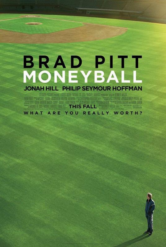
We made plans and Thursday afternoon we screened the new Moneyball film. I thought it was excellent, and for the first time I can remember since American Beauty and Almost Famous I was able to sit through a drama without wondering when the film was going to end.

I'm sure you're familiar with the film if you're a regular reader of this blog - Brad Pitt's character (Billy Beane) hires Jonah Hill to bring his Bill James style of scouting to the Athletics. Drama ensues with a typical Hollywood "Brad Pitt's character is the good guy" ending. As I hinted above, it's a great film about baseball, not just a great baseball film. Jim noted there were women in the theater who probably wouldn't be found at a screening for Major League or The Natural. The setting is the 2002 Oakland A's season, from their loss in the ALDS to the Twins in 2001 through the playoffs. You can tell it's Oakland - the shots of the Oakland port and stadium guarantee that. The story is inspiring and moves quickly enough, with just the right amount of actual baseball included to make it fun for fans of baseball movies.

Speaking of which, how long has it been since we've had a real, good, baseball movie? The last I can recall is A League Of Their Own. Has it been that long? Am I forgetting something?

Billy Beane's character spits tobacco. A lot. I'm not sure if that was important to his character or not, but I certainly noticed it. Pitt does his usual good job of acting, but the surprising actor was Jonah Hill. There were several scenes that he pulled off that I wouldn't expect, most notably the trade scene during the turning point of the movie. Philip Seymour Hoffman is one of my favorite actors, and he did a great job as Art Howe, though I noticed that he came off as quite a jerk during the whole thing, never wanting to listen to Beane's plans and just overall playing almost a villain in the film. At some point he must have come around to Beane's way of thinking, but after the trade scene mentioned above he just sort of falls from the story. Perhaps that was meant as a way of saying Beane made Howe's job meaningless after a discussion they had around that point in the film.

Now I can't judge how true to the characters and reality the movie is, nor how well it follows the book - I was out of baseball and the Bay Area in 2002, and the book isn't in my library yet (that will change eventually). However, factual or not, accurate or not, it's a great film that I will probably end up seeing again (something I don't say very often, especially with dramas). I give it four baseballs out of five.
Now, I mentioned cards in the title. So I suppose I need to hold true to that part of the deal. Jim and I grabbed lunch at Buffalo Wild Wings. This was the first time I've been to BWW since leaving Atlanta, and man oh man, that wing sauce is AWESOME. Before eating, I gave Jim a nice Mike Schmidt I picked up a week ago:
I still owe him for the Sportscasters cards he brought me in June. Well, he said he had some stuff for me off my want list. He mentioned complete sets and junk wax, and I had an idea where he was going.

There were two factory set boxes in a bag that he handed to me as we said our goodbyes. One of them was for 2005 Topps, and I was about to chastise him for bringing me such a great item with nothing planned in return. He quickly brought me back to earth, when he mentioned and I saw that it contained this set:
Ah, 1990 Donruss. I actually like the design. Maybe it's the tiny, itty bitty part of me that appreciates that style of abstract paint-splatter art. I'd do something about the top part of the card, but I can ignore that. In typical junk wax fashion, I found nine players who amount to a net worth of about nine cents in the set.
The other set was in its proper box - the 1991 Donruss set. If you remember (how could you forget), the set came in two series, with each series being a different color. I prefer the green (blue was done to death with the 1988 Donruss set). I have a couple decent players in at the end, just for the fun of it.

Both sets came with the Rookies set, and 1990's included the puzzle!

Thanks a ton Jim, for a great time, and the cards! I've got some Chicles for you. A whole bunch of Chicles.