Chaos and Kanji is the blog where I write about my adventures through Japan!

Want Lists are located here. NPB Baseball Want List is located here.
Showing posts with label 1990s. Show all posts

Friday, January 17, 2020

Uncut Sheet: Hideki Matsui

I recently had a discussion about tackling the 1995 BBM set. It's a large set to begin with, and it's full of SPs that will nickel-and-dime you to death if you're trying to finish it by hand.

There are three nine-card short printed puzzle sets included in that lot. Ichiro is the most popular, of course, followed closely by Hideki Matsui and Hideki Irabu. Packs could include one piece of a nine-card puzzle, but all three puzzles were available in some way via uncut sheets.

I got Ichiro several years ago, and now I have Hideki Matsui:
 This is the front. The nine cards show Matsui's swing progression, and I'm sure someone with more interest than I have could crop this image and turn it into a GIF of his swing.
The backs fit together to form one big image from a different angle. This reveals that the uncut sheet has extra image space; I don't have the regular cards to see if they do this as well. Actually, this raises a lot of questions. Are the regular cards like this? If so, why? If not, why is the uncut sheet like this? Also, if not, does BBM discard small strips of cardboard where the images meet? Is this how card companies due borderless cards while avoiding card edges from looking funky? Why don't I know anything about card printing processes? Do uncut sheets exist for the entire set? Where I can get one? ....

Anyway, this was another pickup from Mercari (Japan). I'm very happy to have it, though if I do tackle the full 1995 BBM set I'm not sure if I'll keep this as part of that set or try to obtain all nine regular cards.

Storing it with the regular set would be challenging. I like oversized cards, though; cards up to letter size fit easily enough in binders using different types of card pages, and large cards look great displayed behind player figurines (yes, I take my bobbleheads out of their boxes; I'm a collector, not an investor).

What do you think about oversized cards?

Monday, December 16, 2019

Set: Completed (and another, and another, and another...)

I'm separated from my cards and the ability to scan for a while, so unfortunately you're stuck with me making idle chatter. But one card I scanned a few months ago brings to a close one of the more challenging BBM sets.

The last post I made before my disappearance was about a set that was nearing completion, and a couple months later, I finally got this card:
The Carp are always a popular team, and Maeda and Etoh were big names back in the 1990s. So it makes a bit of sense that this card would be tough to find. How about that card title? Red Scare?

With that card, the 1994 set is complete. The other big BBM set is 1995 - it's the largest single-series set at 651 cards, and most expensive, with a "book" value of about $550. I haven't started that set, and might not. The set doesn't seem to have any super big-dollar cards in it (I could be wrong... I have no price guide in front of me), but the overall size plus short prints is where its value lies. Of course, the set has plenty of Ichiro and Hideki Matsui cards. As for other BBM sets I need, those, too, are tough to find, though not as pricey. However, my eyes are open for deals.

While I don't have scans of other sets (see above), I have had a good bit of luck picking up some recent Calbee sets.

Until next time...

Wednesday, March 27, 2019

608 Down, One To Go

A quick post with two quick scans!

After searching several shops in Tokyo and Nagoya, my 1994 BBM set had stalled with two cards remaining. But lucky me - one of those cards was listed on YJA this month!

1994 BBM is one card away from completion - a combo card towards the end of the set. I'm certainly happy to be so close to finishing this set!

I'm not sure why Haru was so hard to find. In the end, it cost me a whopping 50 yen (about 50 cents) plus shipping (about 75 cents more), though someone else had it listed for much more than that.

Until next time...

Saturday, February 9, 2019

Flagship Sets from 1994 Aren't Easy to Finish

If I told you I was working on a flagship release from a major manufacturer, issued in 1994, you would probably guess I was trying to put together Topps, Donruss, Fleer, or Upper Deck's set from that year.

And you'd probably ask me, "Ryan, why are you probably spending so much time and money building a set card by card, when you could just poke around just a little and find one pretty cheap on eBay or at a shop or show?"

And you'd be right to ask, since single cards are pretty expensive compared to the overall cost of a complete set, especially from that era.

But I'm not putting together an MLB set. I'm working on 1994 BBM.

1994 BBM. Every Swallows card in the set is a short print.
1994 BBM. A set issued back before most card shops in Japan existed.
1994 BBM. With Ichiro's second-year card and Hideki Kazuo Matsui's rookie card. (And Hideki's second year card, too.)

Honestly, 1990s BBM set building is tougher than 1960s Topps building. At least with the '60s cards, you can find every card somewhere, between eBay, Sportlots, and COMC.

Luckily, some dealer on YJA has been posting team sets from the 1994 set at reasonable prices, and I got every one of them he had. Now, I say reasonable, but the Swallows team set cost me about $70, or about $2 per card. But the cheapest I ever see them in shops is $3, and sometimes as high as $6 per card... for common players.

That still left me with the checklists, some subset cards, and the BayStars team set. 

And for some reason one Marines player.

I'm down to two cards on this set! All that remains is one more BayStars card and one of the subset cards. I'm hoping I can track them down this weekend, though I'm not doing a lot of hunting so I might not have much luck.

Who would have thought 1990s flagship sets would be so tough? I guess my next project will be 1995 or 1996 BBM...

Friday, February 8, 2019

Essential fOils

While everyone laments the difficulty in parting with their excess "junk wax" era cards, few people realize that the late 1990s is full of sets that are interesting and challenging to complete.

I started collecting as a kid during the height of the overproduction period, which was fine with me. I just wanted to buy packs to get cards and maybe make sets. And I didn't even make any real progress in that respect until 1992, when I built the 1992 Topps set pack by pack, with a little trading or buying at card shops thrown in.

As many investorscollectors left the businesshobby around 1994 card strike, card companies were getting more and more innovative with their inserts. It was the 1990s that brought us certified autographs in packs, relic cards, and parallel mania. And before relics and autos really became the selling point of boxes, rare and interesting inserts were the thing.

Remember Fleer ProVisions? People liked those because they looked cool. Rookie Sensations? Donruss Elite inserts? They were super-rare and attractive.

These days, there are plenty of good-looking, desirable insert sets, but they rarely hold the drawing power of a 1990s Upper Deck SP. A lot of my set collection is made of sets from the 1990s, some of which are proving to be quite difficult to finish at a reasonable price.

Take 1996 Pinnacle's Essence of the Game:
Inserted at a rate of 1:23, or about one per box, this 18-card set is full of big names, many of which are in the Hall of Fame. There are rarer cards in 1996 Pinnacle, but the clear acetate background with orange stars (my scanner can't really pick those up) and metallic top really looks great in person. And that's what matters to me. So that's why I'm trying to finish the set.

Since the 1990s are often overlooked and forgotten by sellers, COMC and Sportlots don't have a great selection of cards from the set. But after picking these two cards up at a small card show here in Japan, I'm pretty close to finishing the set off. A little bit more effort this month will see this set knocked off the want list for good!

Tuesday, February 14, 2017

I have Ichiro's rookie card! AKA 1993 BBM: Complete.

 Is this Ichiro's rookie card? Nope. It's a nice card, though.
 How about this one? No. Too bad Ichiro has no World Series ring from those 116 victories.
This is it. I scanned it in a sleeve, and it looks like my scanner handled it better - no blur artifacts on the right edge (you can see the blur artifacts on the right side of the cards before it as a comparison). And you can see that while it's in pretty good shape, it is kind of miscut. But I now have Ichiro's BBM rookie card, and I'm pretty happy about that, to put it plainly.

I found all of the Nomo cards I needed over the past three weeks or so, and I picked up most of the holograms at the same time. Technically, a full set doesn't include the team logo holograms. They are unnumbered, though there are two card numbers reserved in the set for the holograms: one for the Central League and one for the Pacific League. I initially got one logo from each league (the Giants and the Fighters), but I found many of the others for only 200 yen each a couple weeks ago so now I'm only missing two teams. So yes, my set isn't fully complete, but it is technically complete. I will be hunting for those last two cards this weekend!

Saturday, December 10, 2011

1994 Fleer Pro-Visions: A TCIC Feature Post

I'm a walking oxymoron. I love art cards in baseball form, but I generally don't collect non-sport art cards. However, I've seen my fair share of fantasy art in cardboard and full size from browsing dealers and artists at DragonCon. Looking at the awesomeness that is this Tony Gwynn card I'm reminded of those sets, full of crazy multi-mooned nightscapes, exotic locations, and mythical creatures in the foreground. These usually take the shape of bizarre animals or scantily clad women, but there are other subjects.

The Pro-Visions set inserted into 1994 Fleer packs was full of crazy fantasy art. Gwynn, as a man of the cloth (get it? Padres? Ha ha!) is reading from the Baseball Bible, I suppose. I'm not sure what the random dot on the book means, if anything. Tony must have knocked himself in the head with his bat or the book, as he has baseballs flying around his head. The background reminds me of a combination of a Northern California bay full of mountains and sailboats, and the San Diego waterfront, with the palm trees. But it's not the bottom of the background that's really bizarre.

Draw your attention to the top half of the card (as if it wasn't there already). Bizarrely strong sun rays hint that Gwynn is pointed northwest, as that's a beautiful California sunset in the background. Somehow a rainbow is either coming out of the book or going into the book, headed off in the same direction as the sun. Above the rainbow, a brick-like pattern was created by something - was it star ships fighting for control of earth? Was there a Blue Angels airshow where the planes leave those smoke trail patterns? Is it part of the ladder to heaven?

The card makes more sense when placed in the proper order with the rest of the cards in the set. The rainbow and sun rays lead to one card, while the brick path heads off to another. Overall, it is one highly creative work of art, where each player can be enjoyed alone, but the combined group is greater than the sum of its parts.
(Image from Chewing liquorice, which hasn't been updated since June 2011)

The set is a creative masterpiece. It's the kind of set you want to put up on the wall and admire occasionally, and remember those good old 1990s when cardboard wars were about the creative designs, not the serial numbers, pieces of used goods, and autographs.

Wednesday, November 16, 2011

Whatever happened to hologram cards?

Apple has been seen as a company of innovation. All the college kids want a MacBook. The iPod brought music in digital, portable form to the masses. Smart phones were just the wave of the future, until the iPhone came out and flooded the world, and the vision of a tablet PC never materialized until the great iPad was brought to the world. Even things we think are simple computer tasks now were big deals before Apple made them seem easy - video and music editing, digital photos, and even just plain computer care (anyone remember the Mac vs. PC commercials?).


(as an aside, I enjoy this spoof:)


Apple didn't really bring us anything new. Face it. Laptops existed in some form or another long before the first MacIntosh computer came out. I had a 20GB mp3 player before the iPod was even announced. I had a PDA with a color touch screen back in the 1990s, well before the iTouch was released. Ever hear of a Blackberry? Yeah, that beat the iPhone to the punch. And as for tablets, well, I've seen them for quite some time.

But Apple did something great with each one of those products. They didn't just make another mp3 player, they made it "legal" with the iTunes store. They didn't produce just another smart phone, they created a "safe" world with apps that wouldn't crash your entire device should something go wrong. MacBooks are so easy, even my grandma can understand them. In other words, Apple made these technologies "safe" and "user-friendly" - that is their image. Just watch the commercial above, again. That's their whole point. (Granted, users have very little flexibility with their system as a result. But this isn't a discussion on the merits.)

Just like Apple, over the years, Topps has taken other ideas and made them their own. They crushed Bowman in the 1950s, stealing the bubble gum card market in a matter of years. They've duplicated 3D cards, shiny foil cards, parallels, relics, autographs, card materials; if you can name it, Topps has probably done it.

But there's one technology I haven't seen Topps use, and that's holography.


Maybe I'm missing something. Upper Deck started it all, really, with some hologram inserts and sets in the early 1990s, including this Ivan Calderon above. A company issued a set called SuperStar Holograms around the same time. Denny's hologram cards were a huge hit. BBM, Lime Rock, Front Row, even Pinnacle (by way of Denny's) got their logo on a hologram card. But Topps has yet to copy the technology.

It's not like the cards are ugly. Sure, the scan above isn't great, but in person, these holograms look much better than many foil issues. Flat Ivan looks regal and important, up close, while 3D hologram Ivan in the back is probably on his way to second with a double.

I wonder what Joe Mauer's 2011 Topps card would look like in a 3D hologram. Or some of those play-at-the-plate shots. I want to see a hologram card with a player sliding into third, clumps of dirt appearing to fly off the card. Give me a pitcher's card with the ball headed right for me.

The card above is yet another prize I grabbed in the Jaybarkerfan's Junk blog party!

And if you're wondering, I wrote this entire post on a Windows laptop.

Saturday, October 22, 2011

The Promo King!

Promo cards had their place back in the days before the internet. What better way to show how great a card looks and feels and build interest than to release an example? These days, Topps "leaks" preview images through Twitter and Beckett, and sell sheets are available through all sorts of sources, so collectors don't need to go to a store to know what's coming soon. But back in the 1990s, manufacturers sent promos for nearly every set.
 Fleer, Donruss, and Pinnacle are all represented here. You'll notice that Fleer and Donruss provided samples of base issues (Ultra, Leaf, and Emotion-XL), while Pinnacle added promos of the multitude of inserts they shoved into their products to add value to the boxes.
You're not seeing double. You're seeing doubles. All the cards seen here were provided by Kevin (The Diamond King) as a part of yet another trade-to-be-named-later. (Thanks, Kevin!)

It's kind of funny how Beckett lists promos. Some sets get their own "Samples" set listing, while others are tacked on to the checklist at the end. Since my database is built from Beckett's listings, I find myself having to add several of these promos into my spreadsheets. So while I add more cards to the type collection, it doesn't reduce the number of cards I need. Which hurts the percentage - I'm currently at 19.69%, and my goal is 20% by the end of the year (which would be an amazing 3.1% gain since March, and about 3.5% since I moved to California last September). I'm excited, but I'll need 150-200 more cards to do it. I've got about two months! Let's make this happen!

A little video, as it seems I usually add these days.
A couple days ago, it was Moneyball. Today, Pitt-Pong.

Sunday, October 16, 2011

A Stadium Club Set-Up

You've seen these all before, right?
Topps decided for some reason to issue team sets in 1993, with a design that's completely different from the regular issue. Each team set was issued separately, in cardboard boxes, blister packs for retail, and plastic cases (seen here) for hobby stores. Of course, being 1993, the sets were fairly overproduces, and can be had for a dollar each or less. Not having my lists with me, I grabbed one of every team available at a sketchy East Bay card shop and after scanning them left them somewhere - that somewhere eludes me at this time. But I believe I needed all nine teams!

Speaking of Stadium Club - I have a few complete sets to offer as trade or for sale. In my pursuit to have a complete Stadium Club set run, I picked up a lot that included some extra sets. I have full sets from 1991, 1995, and 1996 Series 1. I also have a 1999 Upper Deck Series 1 set, and a good-sized lot of 2006 Upper Deck Series 3. If you're interested in any of those, let me know!

Wednesday, October 12, 2011

Pinnacle Snaps in 1998: A TCIC Feature Post

Some of the best sets to be released, as far as the photographic quality is concerned, came from the late-90's Pinnacle and Zenith issues. It seems like the company spent most of its time in the 1990s making random foil and limited/serial-numbered issues without really focusing on quality photographs and photo-first designs. But eventually - maybe a little too late - the company realized that Upper Deck was getting all the recognition for its beautiful base cards. I think Pinnacle ended up with way too many great photos, because in 1998 it issued packs of "team snapshots."
 The photos aren't all action-oriented, but they're still beautiful. The whole idea was to show the players in candid situations, rather than the typical posed studio images or standard action shots. Each photo is 4x6, and the backs are essentially blank - set/manufacturer identifying information is printed similar to the way the Kodak logo is printed across the back of photos. The photos really show off the vibrant, bright, colorful imagery seen in 1998 Zenith. Looking at the jerseys, it seems that the photos might have been all taken on the same day - or at least taken on Sundays, as the Braves sport their alternate Sunday jerseys in all the pictures here.
As you can see from the pack wrapper, each envelope (again made similar to photo envelopes) comes with 8 of 18 snapshots, and are team-specific. Theoretically, one would only need three packs to complete a team set.

The teams issued were: Angels, Braves, Cardinals, Cubs, Devil Rays, Diamondbacks, Dodgers, Indians, Mariners, Mets, Orioles, Rangers, Red Sox, Rockies, and Yankees - fifteen teams, for a total of 270 snapshots. Packs were issued regionally, so finding Braves packs here in San Francisco was somewhat surprising.

I picked this pack up in August for a dollar, and I wish I had bought more, as it is a great set, as far as photography is concerned. I kept one of the snapshots for my collection, but the other seven are for trade. I don't remember who they are - you can see four of them above - but I'd like to trade them all as a package deal. If I come across a bunch more, I may try to assemble a master set.

Monday, October 3, 2011

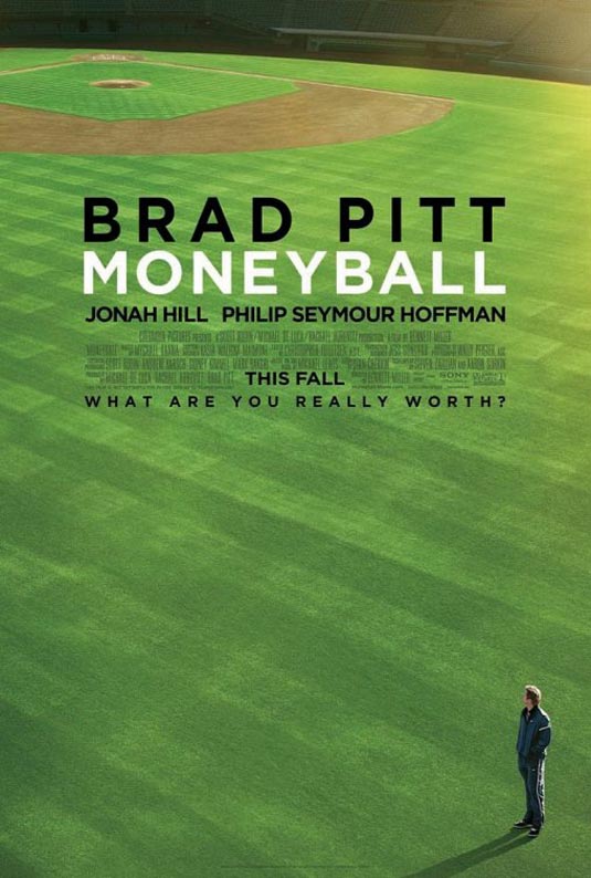
Moneyball! and cards!

Jim is a blog reader who's developed into a friend over the past year - he lives across the bay so we've found time to get together a few times. You'd remember him from this trade post.

We made plans and Thursday afternoon we screened the new Moneyball film. I thought it was excellent, and for the first time I can remember since American Beauty and Almost Famous I was able to sit through a drama without wondering when the film was going to end.

I'm sure you're familiar with the film if you're a regular reader of this blog - Brad Pitt's character (Billy Beane) hires Jonah Hill to bring his Bill James style of scouting to the Athletics. Drama ensues with a typical Hollywood "Brad Pitt's character is the good guy" ending. As I hinted above, it's a great film about baseball, not just a great baseball film. Jim noted there were women in the theater who probably wouldn't be found at a screening for Major League or The Natural. The setting is the 2002 Oakland A's season, from their loss in the ALDS to the Twins in 2001 through the playoffs. You can tell it's Oakland - the shots of the Oakland port and stadium guarantee that. The story is inspiring and moves quickly enough, with just the right amount of actual baseball included to make it fun for fans of baseball movies.

Speaking of which, how long has it been since we've had a real, good, baseball movie? The last I can recall is A League Of Their Own. Has it been that long? Am I forgetting something?

Billy Beane's character spits tobacco. A lot. I'm not sure if that was important to his character or not, but I certainly noticed it. Pitt does his usual good job of acting, but the surprising actor was Jonah Hill. There were several scenes that he pulled off that I wouldn't expect, most notably the trade scene during the turning point of the movie. Philip Seymour Hoffman is one of my favorite actors, and he did a great job as Art Howe, though I noticed that he came off as quite a jerk during the whole thing, never wanting to listen to Beane's plans and just overall playing almost a villain in the film. At some point he must have come around to Beane's way of thinking, but after the trade scene mentioned above he just sort of falls from the story. Perhaps that was meant as a way of saying Beane made Howe's job meaningless after a discussion they had around that point in the film.

Now I can't judge how true to the characters and reality the movie is, nor how well it follows the book - I was out of baseball and the Bay Area in 2002, and the book isn't in my library yet (that will change eventually). However, factual or not, accurate or not, it's a great film that I will probably end up seeing again (something I don't say very often, especially with dramas). I give it four baseballs out of five.
Now, I mentioned cards in the title. So I suppose I need to hold true to that part of the deal. Jim and I grabbed lunch at Buffalo Wild Wings. This was the first time I've been to BWW since leaving Atlanta, and man oh man, that wing sauce is AWESOME. Before eating, I gave Jim a nice Mike Schmidt I picked up a week ago:
I still owe him for the Sportscasters cards he brought me in June. Well, he said he had some stuff for me off my want list. He mentioned complete sets and junk wax, and I had an idea where he was going.

There were two factory set boxes in a bag that he handed to me as we said our goodbyes. One of them was for 2005 Topps, and I was about to chastise him for bringing me such a great item with nothing planned in return. He quickly brought me back to earth, when he mentioned and I saw that it contained this set:
Ah, 1990 Donruss. I actually like the design. Maybe it's the tiny, itty bitty part of me that appreciates that style of abstract paint-splatter art. I'd do something about the top part of the card, but I can ignore that. In typical junk wax fashion, I found nine players who amount to a net worth of about nine cents in the set.
The other set was in its proper box - the 1991 Donruss set. If you remember (how could you forget), the set came in two series, with each series being a different color. I prefer the green (blue was done to death with the 1988 Donruss set). I have a couple decent players in at the end, just for the fun of it.

Both sets came with the Rookies set, and 1990's included the puzzle!

Thanks a ton Jim, for a great time, and the cards! I've got some Chicles for you. A whole bunch of Chicles.

Saturday, September 24, 2011

Box Break: 1997 Pinnacle XPress

Earlier this week, I mentioned the Pinnacle XPress set for the inclusion of metal cards. Just by luck, I was able to buy a box of it, and I broke it Thursday night.

First, here's what a box looks like:
 I had to take the picture with my iPod, so it's not the best shot possible. Each box contains two packs - a nine card hobby pack and an eight card "Master Deck" plus the guaranteed die cast metal card. Opening the box makes for a nice presentation long before all those fancy high-end sets with their fancy boxes came out:
As you can see, there is no suspense as to the metal card once the shrink-wrap is off.

Here's my metal card:
My man! It was nice to see him when I opened that lid. I'm trying to put this metal set together, so the card goes to that purpose first. (silver odds 1:54 boxes, gold 1:108 boxes)

Next was the hobby pack, which contains nine cards including the game card.

Odds:
  • Swing for the Fences Player Card 1:2 packs
  • Swing for the Fences Booster Card 1:2 packs
  • Men of Summer parallel 1:7 packs
  • Far & Away 1:19 packs
  • Melting Pot 1:288 packs
  • Metal Works Silver Redemption 1:470 packs
  • Metal Works Gold Redemption 1:950 packs

 Most of the set is horizontal, so first you see the horizontal cards. Below are the vertical.
My Swing for the Fences is a player card, as you can see. I pulled a Men of Summer parallel here (I would have rather had an insert, of course) - the shiny Kevin Orie on the left-hand side.

The "Master Deck" is really just a second pack with better odds:

  • Swing for the Fences Home Run Base Card 1:1 packs
  • Men of Summer parallel 1:1 packs
  • Far & Away 1:5 packs
  • Melting Pot 1:189 packs
So much horizontal! Except for that home run base card, they're all sideways! My parallel is in the upper left, the Jason Giambi. The Men of Summer parallel isn't too exciting, with only the foil to distinguish it. The words "Men of Summer" are barely visible on the back. The Home Run card is exclusive to the Master Deck packs and was one of the key components in winning the game.

I can see why this set wasn't successful. The game and Metal Works were the only two parts of the release that were worth pursuing - the base cards look like a rejected Pinnacle design and the parallel has nothing more than the Score Gold Rush parallels have.

But those Metal Works cards are awesome, and totally 1990s Pinnacle gimmicky!

Sunday, September 18, 2011

Hammerin' Hank Aaron's best Autograph?

Not this exact copy, mind you. But look at that card. This autograph is clean and crisp. It's on-card. It's certified (you can check by looking at the UD Hologram on the back - it should be a diamond instead of a home plate) and the signature should be blue (sorry bud bud bud). How does the same (fake) card end up being listed on four websites anyway? At least Fuji's fake is different. I'm told the autographs tend to fade, which is a shame. The card image is fantastic and a quality autograph would make this an excellent showpiece.

I don't own a Hank Aaron autograph, though I wouldn't mind having one. I do have the regular set that card came from:
If you collected cards in the early '90s you should remember this continuity insert. Reggie Jackson was the first in 1990, followed by a whole series of great players. After a few years Upper Deck changed the design a bit and did a multi-player Future Heroes set, and then completely mixed things up by foiling up the cards, making them extremely rare, and turning the line into something only collectors of the Elite Series inserts could afford. Yes, there's bitterness in my writing. I need most of the Ruth Heroes of 1995, and all the SP Heroes from 1996 and 1997. The line died out until the early part of this century, but the full history (and my frustration with putting a full set together) is better saved for its own post.

I get the feeling that some people don't like the Baseball Heroes line. I know that most of these cards aren't too special, but the Reggie Jacksons looked great and the recent "marble" redesigns are attractive. Plus, I like the header art cards. You probably already knew that.

I picked up the full Aaron set for a dollar at the GT Show. Oh how the mighty have fallen! The 1991-1993 inserts were such common pulls that they became almost worthless on the secondary market. I already had this set in my Upper Deck Heroes collection, but several of the cards highlight events that I could use in my Awards/Leaders collection.

This is the last scan I have for you from the GT Sports show. I know you're sad. Don't worry! I picked up several great oddball items at the MMA show at Vallco Mall. It's a new location for MMA and there were more dealers this weekend than the usual MMA show. If you're in the San Jose area today (Sunday) and you're reading this in the morning, take a sweep down to check out the offerings. I talked to a few dealers and several told me they might not be doing any more shows for a while (table fees are high is the general consensus).

Friday, September 16, 2011

Just the Fax, Ma'am.

What do you do if you're a British card company looking to sell more cards? You make a set with several American sports superstars, throw in a few other stars of other sports and nations, and sell it complete in a playing card box.
Fax Pax was recently featured on Cardboard Zoo. They were never too successful, though they tried to find a niche in some of the smaller sports. The checklist can be seen on the back of the box, scanned above. As you can see, most sports celebrities who were famous in America or worldwide were included in this 1993 set. If the printing quality was better, this would have been a great set of its time, with full-bleed photos and a nothing-but-the-greatest checklist. As it stands, this set was grossly overproduced and can be found on the cheap. I picked up the set for a dollar last month.

Still, it's better than Goodwin Champions, right? At least they used game photos.

Thursday, September 8, 2011

Did you peel?

You have to give Donruss credit for trying.

If you asked me what my favorite brand was in the 1990s, I would have had to replied Fleer, because their sets and inserts were just too-well designed (if you like the '90s stuff, which I do). But Donruss would have been second, especially once they were absorbed into the Pinnacle Brands failure of a mega-card company. The Donruss and Leaf product lines never really interested me, but Diamond Kings were cool, and Studio was one of my favorite sets. While most of Donruss's early attempts at chase cards (other than the DKs) were relatively uninspired, they found a good mix with several sets starting around 1994.

One of those quality sets was the Mound Marvels release:
Scanning the cards does nothing to help them look nice. To protect the shiny surface, some sets were covered with a protective film that could be peeled to "reveal" the card beneath. It really wasn't some magical surprise with most of the cards, though some sets were covered in a black film that you had to peel to know what was beneath. All of these cards have their protective film. The "REMOVE PROTECTIVE FILM" sticker was really easy to remove, and I remember removing mine from most of the cards I pulled in the '90s. You can even see the film bubbling on Jimmy Key.

The special film and shininess isn't what makes these cards cool. Instead, it's something I didn't even notice until I was scanning the set, and it's something you can barely see. Inside the circle is a transparent window with a portrait of the player. It's most noticeable in the Jimmy Key card. At first, I thought the circle, which in most instances appears as plain silver, was a failed attempt at a hologram image or was supposed to represent a mound or baseball. I suppose if I peeled the cards I would see the shininess and transparency better. I may just have to do that. The temptation is unrelenting.

The set is a who's-who of 1995 pitching, though Maddux and Johnson are the only two who became true superstars. This would be my third-favorite insert set in the 1995 Donruss release, behind Diamond Kings and the Elite Series inserts, of course. The set is full with these eight cards, and it's headed as a featured set in my This Card Is Cool collection.

So, did you peel? Would you?